Wednesday 30 September 2020

Term 4 Prompts: Oct 1- Prompt 20

 It's Inktober!

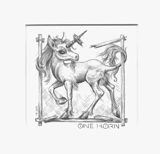
I am going to start off Term 4 prompts a little differently by utilising INKTOBER as my inspiration. You haven't heard of INKTOBER? You can read all about it HERE. Basically the idea is to do one drawing a day in ink for the entire month of October. You can post it to the Instagram page if you like or not. It is a way to encorage you to draw as much as possible for one month.

Now, I know a lot of you are very busy and a drawing a day is a difficult thing to ask. So, instead, I would like to to choose ONE of the prompts from each week and draw that. This will give you 7 different ideas to choose from and be inspired by. Of course, if you want to do more or even all 7 then go for it.

It would be nice if you used ink somewhere in the drawing. But I am not holding you to using ink exclusively, so if you want to just use a little wash here and there, or some line work then that will do. Send it to me in the usual way and I will post it here. Please make sure you include the prompt in your file name. Of course you can also post to INKTOBER where you will have a wider audience for your drawing.

I will post each group of seven prompts every THURSDAY, starting today. Hopefully this will give you the weekend to think about it and work on a drawing. So, here we go with the first 7 prompts;

  1. Fish
  2. Wisp
  3. Bulky
  4. Radio
  5. Blade
  6. Rodent
  7. Fancy

Wednesday 23 September 2020

Grimm #1

 The Nix in the Mill Pond

The Grimm Brothers original stories were collected from oral tradition and were generally not meant just for children but for everyone. Some are quite grisley and if I may say it, grim. They have been retold many times, cleaned up and 'Disneyfied' . Recently they have been retold by for modern reader by acclaimed author Philip Pullman. 

I thought it would be fun to draw a few of my favourite original (and possibly darker) tales. This is my drawing of 'The Nix in the Mill Pond' - a beautiful water fairy who helps a Miller out of financial difficulties on the promise of his recieving his first child. The Miller becomes successful, but reneges on the deal, keeping his son well away from the fatal pond. The boy grows to a handsome man, becomes a Huntsman and marries a local girl. One day out hunting he strays too close to the Millpond and is snatched by the Nixie.

The tale has a rather strange ending - the young wife rescues her husband but they are turned into a toad and frog! A flood washes them out of the country and they resume their human form but forget all knowledge of each other for many years until finally they meet and recognise each other and live happily ever after. 

But what of the poor Nix? I always thought she was cheated on the deal. She gave the Miller good fortune and was promised a lad to love for her own. The humas win out and live happily ever after but the Nix is doomed to loneliness in her waterey home. No wonder she gets annoyed.

'The Nix in the Mill Pond' by Linda Weil
Graphite and Graphitint on 300gsm Lana Hotpress paper. Image area 23 x 18 cm


Sunday 20 September 2020

Week 19: KM, JD & Silke

Ella says it best! 

Three more submissions to our 'Anything Goes' Prompt starting with:

KM

KM says she has been enjoying these prompts, and I have to compliment her on her dedication and progress this term. She has contributed to each prompt and has shown steady improvement in technique and confidence in her drawing skills. She has also been indulging in a few new pencils - this week adding Derwent Metallic red, green and pink to her work. She has also used standard Derwent colour pencils, dark/soft graphite on Hot Press paper to create a still life of her favourite flowers, carnations.

This is a good still life study, KM has used her colours well, layering and blending to build up the hues. She has paid attention to the shapes of the foliage and how each leaf or bud is attached to the stems. I like how the stems are not all standing straight up and down, but also cross over each other creating a nice dynamic in the vase. The pink carnations are puffs of colour - not a lot of detail, just enough to create the effect.

The glass vase is a little flat, without much depth or sparkle, but it does work stylistically with the rest of the drawing. I would caution KM to be a bit careful about the shadow placement, I am not sure the shadows behind the top right carnations work as intended. All that being said, an excellent drawing to finish the term with KM! 

'Lockdown treat' by KM

JD

JD's scanner is playing up, so she can only show us smaller phone shots so it is difficult to see the detail. But we can see enough to realise JD has done beautiful work . She has finished her Hellebores work and it is very successful. The shapes and colours work well, and the addition of the top of the mason jar acting as a vase grounds the work well. Previously the flowers were just 'floating' on the page, now there is a reason for the arrangement.

'Hellebores' by JD

JD also has a work in progress that looks very promising. Another botanical still life drawing of beets created on A3 Eraldo Di Paolo Hot Press with Faber Castell Polychroms and Staedtler HB. This work has a lot of potential and is coming along well. Remember to add cool tones (blue, violets) into the shadow curve of the beets to create depth. Also those cool tones would give you addtional shape in the leaf shadows. Again, cool tones such as a light indigo blue will work for the cast shadows on the table - don't be tempted to use grey/graphite or black here, start with a light tone fading off and increase the hue if required as you complete the plants.

Both works are great JD. One note is to remember to pay more attention to planning the placement of your drawing on the page so elements don't run off the edge- give yourself a bit more breathing room. I always use a sheet of paper much larger than what I think the work will be as it almost always tends to 'grow' a bit. Paper is cheap enough!

Well done!

'Beets WIP' by JD

Silke

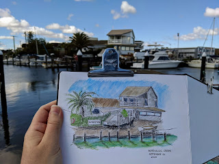
Using the new 2 hour exercise time allowed in our lock-down, Silke walked to Mordialloc creek and did some urban sketching of the old marine supply house there. This building has been there for donkey's years and as Silke found, not a single straight line or corner to be found! She says she found the perspective difficult as a result, but that slight wonkiness gives the drawing and the building charm IMO.  I know that this area is being progressively refurbished so it is nice to get these older, character buildings recorded.

Silke has used a black Fineliner and Albrecht Durer watercolor pencils in a Hahenmuhle watercolor sketchbook to create this drawing. And doesn't it make us all want to get out there in our 2 hour times and take a walk and do some sketching? Inspiring work Silke!


'Old Marine Store, Mordialloc Creek' by Silke

*SUGGESTION* If, and when, this lockdown ends, it would be fantastic if all of you who have participated in these prompts could meet for a sketch-out. Mordialloc creek is a good venue, with picnic tables available.  Once more than 5 of us can gather at a time let's do it!


'End of the Pier' by Linda Weil
A drawing from the pier end of Mordialloc Creek

Friday 18 September 2020

Week 19: MP, Jean, Monika, & K

 Anything goes!

MP

This is a charming portrait of MP's grandson. I have worked with her previously on an earlier version, and with this work here she has started again, revised and refined to creaate a more accurate likeness physically and of the character. Drawn on Art Spectrum 300 gsm HP, Monika has used a 2H in the early stages to establish the shapes of the features and then has built up the colours in layers with Prismacolor Premeir Pencils.

The features are very well drawn, the shape of the eyes in particular. Remembering your earlier work it is good to see you have paid attention to the angle and set of the eyes in this work. A big improvement. Very good layering of coloured pencil, building up of colours and working well with the hue and temperature. The hair is also much improved as you have started to use more negative drawing to create the shadows of the hair rather than trying to use each pencil stroke to become a hair.  The only issue I have with this work is that I feel that using black in the mouth was not the correct choice - the eye is drawn to this strong area. I realise the photo may be quite dark here, but it is overpowering in a c/p drawing. I would suggest you take it back a bit around the lower lip (try to blue tack off by gently dabbing at it) and use a dark umber instead of the black. Leave some of the black in the corner of the mouth if you feel it needs it.

Overall you should be proud of this work - what does Nicholas think?

'Nicholas' by MP

Jean

Jean has fallen in love with her niece's Border Collie pup and has drawn this pencil work of him at 6 months old. This sweet pup is drawn on Fabriano HP 300gsm using 2B, HB and 2H pencils. She has worked from personal photos but has also sourced some online images of BC's in order to see the ear detail better.

He is a very fluffy pup, with an engaging face and endearing eyes. You have caught that pose very well, Jean. Your handling of the fur is greatly improved from the last work of this pup I saw.  A few hints - when drawing fur/hair, try to avoid it looking 'combed'. By that I mean all the hair strokes lining up in the same direction. Hair generally flows one way, yes, but it is also more random and will cross over each other and change directions. Try and be a bit more naturalistic with your line strokes, change them about and not always work in the same directional sweep. Avoid abrupt directional changes. Be careful how you add the shadow strokes in the white fur, slow down a little and consider, don't rush.

About the grass and your question if you should add tone or leave outline only - either would work well although I tend to lean toward adding tone. That is up to you. If just leaving white with line, you need to keep it sharp and crisp where it meets the fur. If you add tone instead work from midtones first, then add the deep shadows. The grass should be lighter in tone than the dog so don't get too heavy too soon.

Again, congratulations on capturing the pose and personality of this guy so well. All the other stuff is just technical detail, youv'e done the hardest job of creating a charater.

'6 months old' by Jean

Monika

I think we are all spending a little too much time in the kitchen these days and Monika's Garlic drawing reflects this. This is lovely little study drawn with graphite pencils 2H to 5B and Faber Castel colour pencils in her visual diary. The shapes and forms are well drawn. The colour enhances the drawing and helps to show the structure of the bulb.

I am not sure if the dark lines are a black pencil or the 5B graphite, but once again I caution about using the black pencil too often. As in MP's portrait, the black lines really stand out and dominate the subtle colors you have used elsewhere. Perhaps you could have used a deep violet or indigo blue to create these shadow lines and cast shadows, then add black/5B selectively if needed. When you use pure black or heavy B pencil like 5B to create a contrast you miss out on the more powerful effects of changes in hue and use of complimentary colours. This isn't to say you should never use black, just be aware of how dominate it can be and use it cautiously.

Still, this is a great study work and is enjoyable to look at. Well done.

'Garlic' by Monika

K - a WIP

It's been another tough week a the hospital for K and we all hope this starts to ease off soon here in Melbourne - everyone of us is very grateful for the sacrific and hard work of the nursing staff and all the support workers out there. But as K has found, what better way to relax, unwind and take your mind to a better place than to sit down and create a drawing!

Here is a wonderful work K has been working on for a few weeks when she can. It is still a work in progress and K says she has a few tweeks she wants to make yet this weekend. Done in colour pencil with graphite support on Fabriano HP 300gsm.

The feather work on these two chuckleheads is quite good. The bird on the left is .a tad overweight and needs to cut down a bit on the lizards he is eating - but Kookaburras also tend to look fat when they hunch down like this. Could the tails be a bit broader K, you think? And I would be tempted to add a bit of indigo shading as needed in their white vests. A nice composition, good interaction between the two subjects. Good tonal and colour rendering. Nice work K!

'That Old Joke!' by K


Thursday 17 September 2020

Week 19: Rosalie, Don & CursedGirl

 Welcome to the final week of Term 3!

I hope you have all enjoyed the prompts for the past 9 weeks and done a bit of drawing. Even if you haven't wanted to show your work it is important to keep up the practice. I will be doing prompts for Term 4, which will begin in the first week in October.

Rosalie

As Rosalie has been doing some on-line botanical classes, she thought you would all be interested in what she has been learning this week. She has been learning the art of blending colour pencils using solvents! This is a fun way of mixing waxed/oil based pencils to achieve a really smooth and polished finish. Solvents also can make the colour quite intense and brilliant.  I haven't used this technique for decades as I always found the solvents too irritating to use and they made my asthma kick in. But Rosalie has used a product called Zest-it which is reported to be low irritant.

Using Polychromos on Fabriano 300gsm TW HP she blended her pencils with Zest-it , she says:

"Ways of applying are brush, cotton bud, tortillion, I also tried silicone shaper. None worked well until I used it in a separate jar with a sponge in it and dipped the tortillion in the wet part of the sponge being careful to make sure it was clean when I was changing colours."

These two studies are nice experiments in the technique and well worth exploring further.  You can find out about the product from the Zest-It website HERE. The product is designed for use with waxed/oil based pencils - not sure how it would work with water colour pencils and would need to be experimented with - but I really don't know if you need to as you can already 'paint' with w/c pencils...

An interesting video I found from Kirsty Partridge -  her tests are interesting and show how you can blend in various layers: HERE

'Zest-it studies' by Rosalie

Don

Don has also taken this weeks prompt as an opportunity to experiment a bit:

'I've been wanting to try pen and wash, so I had a go at this pic I took somewhere in Italy...'

Using Canson 220gsm watercolour paper Don created light washes with Prismacolour watercolour pencils and added detail with a 0.1 Unipen Fineliner. A delightful little drawing that hints at the summer Tuscan sunlight. I like how you have used the pen to create texture in the wooden doorway. Your perspective is pretty good too. I like the stonework jigsaw-  perhaps a little more pen texture rather than outlining each stone individually is needed - but, what you have done works quite well and is an interesting technique. Very nice.

'Italian Doorway', by Don

Cursed Girl

CG is walking on the side of the angels this week with this fantasy manga style drawing. She has used graphite line alone to express the contemplative pose of the angel. The form is good, the blank face evocotive. Perhaps the arm could be longer and less 'stick' like, it lacks form. The soft strokes in the wings create a feathered effect well.

I would love to see CG try adding more colour or tone in a manga style to her works. Not much, just a touch. HERE is a great video from Mark Crilley showing 4 different ways to try. Give it a go CG!

'Angel' by CursedGirl

Fabulous works you three... Anyone else?


Monday 14 September 2020

Week 18: Silke

 Before I forget!

One final submission for Week 18: Myth - and it's a cracker!

Silke has drawn a Kraken for us... on a cotton face mask. What a great idea. She has used Crayola fabric markers on a white cotton mask to create this lovely graphic image of a deep sea monster. I can just imagine the looks and comments when she wears this out on her walks. Great fun Silke.

'Kraken' on cotton mask by Silke

Don't forget to participate in the last Term 3 prompt #19 'Anything'. Submissions due this Sunday. Information regarding Term 4 prompt series will be given Sunday evening, Sept 20.


Sunday 13 September 2020

Week 19 Prompt

 Final prompt for Term 3 is...

ANYTHING


That's right, what ever you desire! I know many of you have been working on side projects, or perhaps have not yet completed an earlier prompt and wish to finish it. So in our final week anything goes! Finish a work, start a new one you have been thinking about...any subject and medium. And to start you off here are two of our regulars with some work they have been doing.

CursedGirl

Not content with just paper and pencil, CG has been branching out into stencilling. And also adorning her rollerskates!

'Roller Girl' by CursedGirl

Completed skate by Cursed Girl - Pretty!

KKat

This beautifully rendered snake from KKat has been created with Staedtler Mars 2H, 2B, 4B and Faber Castell HB & 6B in a Daler Rowney 150gsm sketch book. Wonderful handling of tonal range KKat. I really enjoy this drawing of yours. 


'Snake' by KKat

Saturday 12 September 2020

Week 18: Monika & JD

 Drawing a Myth

This weeks prompt said, 'What vision in your mind's eye does the concept of a myth conjour up for you? It could be an object like a the Giant's magical Harp, or Thor's hammer...' 

How should this theme be interpreted? Some of you have used objects or references from the web to inspire you, creating new works. Others chose to understand the brief in a more literal way. Here are two examples of the different approaches.

Monika

Monika's father comes from Ljubljana in Slovenia, which is known as 'The City of Dragons', so she has drawn a dragon from the famous Dragon Bridge only a block away from his family home. She has used photos and a souvenir paperweight to reference the dragon and inspire her drawing. But she has not treated it as a realistic drawing and has not done an drawing of a dragon statute. She has created a drawing of the myth of the dragon based on real life references. 

Using a 2H pencil to sketch the outline, she drew in detail with a Rotirng graphic 0.3 pen. Using Inktense pencils in pink, yellow and purple she created wash effects then intensified once dry with colour pencils. Finally she used a Rotring 0.1 and 0.5 to add detail and highlight.

By adding colour and not trying to draw the 'paperweight', but draw a dragon, Monika has brought to life the legend of the dragon on the bridge. Her dragon lives and breathes and she has illustrated the myth.

'Dragon' by Monika

Drawing with reference by Monika

JD

As Monika did, JD has used an actual object as her reference. In this case she has drawn an Egyptian alabaster canopic jar. This is one of 4 jars, each jar representing on of the four sons of Horus - jackal, baboon, falcon, human. JD has chose to draw the falcon head jar using Staedtler Graphite HB, uni pen fineliners in sepia and light grey.  She began with Prismacolor watercolor pencils lightly washed to create tones with more colour added when dry to intensify the hue. Drawn in her Windsor Newton 200gsm heavyweight diary JD has done a very well drawn and realistic rendering of the object.

The use of colour works well, JD has successfully created the texture of the alabaster material. It is a well drawn work as well, her attetion to shapes and the perspective ovals are pretty good. I like the use of the sepia pen to create detail and give the impression of the inscribed heiroglyphics. A good drawing of the object....

...but... it is not, IMO, a drawing of a myth. It is a very literal drawing of an object relating to a myth. A quite good drawing though, which is why I wanted to show it here.

What do you think? Do you feel I am wrong? Is this a work that represents a myth? Post a comment and let me know your thoughts - I am more than happy to have you disagree with me!

'Falcon Canopic jar' by JD

Conpic jar references by JD


Friday 11 September 2020

Week 18: CursedGirl, Don & KM

 Some more mythological animals!

Cursed Girl

This week CG has created a Centaurides (female centaur) for us. Using white card and 2H and B pencils she has drawn this image in a Japanese manga style using outline alone. Her work features many of the common manga style techinques, large eyes, small and pointy nose, small mouth usually just a line and expressive hair. She has worked this image up from imagination and without any reference materials and has done a good job. The construct of the anatomy is believable. I think the foreshortening of the right front leg could be worked on further - I know CG has improved it but it is still a little too long. Overall a fun image and a nice mythical work.

'Centaurides' by CursedGirl

Don

Don has complained to me that the mermaids at Mordi beach were not around this week, so he has referenced some ideas from online. He has created this lovely rendering in 2H to 4B graphite pencils in the Windsor Newton 200gsm smooth visual diary. 
Don, you have done a wonderful job here with this fantasy piece. I like the way you have created a fish skin texture with a scrumble technique. The flowing hair works well - maybe could have been a bit 'weedier'? And the combination of smooth tone and line work on the skin is effective. The fish tail has a lovely flow.
The background has been created using soft pencils and a pencil stump. Don has asked me for tips on different ways to create backgrounds - I think that might be a class or six once we can meet again! There are many different ways to do this depending on what your image foreground is. From blends like you have done, to layering, crosshatching, soft circular fills, lines, suggested foliage - endless possiblities. Let's hope we can get back to the classroom in 2021! Until then, you are doing very well. Perhaps you could soften off the edges of this background to blend out to white?

'Mordi Mermaid' by Don

KM

The Celtic Tree of Life is KM's choice this week. The myth is that the tree reaches to both the underworld and the sky with the treetrunk being the connection between the two worlds. The tree is the conduit to the gods. KM has used a circle border to represent the world with the roots and branches touching the circle and connecting to it.

KM is working with pastels again this week and she has used a 160gsm pastel paper for this work. Building on what she learned last week, KM has used more layering techniqes rather than trying to blend. Good work KM, this has a nice stylistic feel to it. Very Arts & Crafts style of design. Did you consider trying a Celtic Knot in the roots? It almost looks as though you have. You should be pleased with this design.

'Tree of Life' by KM


Week 18: MP, Jean and Rosalie

 Myths and Legends brought to life on paper.

MP

MP has drawn on her travels once again as an inspiration for the theme. She has created a reproduction of one of the 6 in the series of tapestries 'The Lady and the Unicorn' found at the Musee Cluny in Paris. These faboulous tapestries are rich with sympolic meanings woven in wool and silk. The backgrounds are scattered with millefleur (thousand flowers) that were a speciality of the Flanders workshop that created them. Each tapestry represents a different 'sense': touch, taste, smell, hearing and sight- the interpretation of the sixth 'A Mon Seul Desir' remains unclear. Just like MP, I too was fascinated and enthralled with these when I saw them in Paris. A mere afternoon was not enough to fully appreciate the beauty of the works.

Using Art Spectrum Hot Press 300gsm with 2H graphite and Prismacolour Premier pencils MP has studied 'Sight' and created a very nice rendition in colour pencils. She has chosen not to include all the millefluer in the background which I think was a good decision! The figures are well drawn, the fabircs and folds well handled. Even though MP says she found it difficult to draw something that wasn't quite 'real' the resulting unicorn is believable. Remember, MP, most fantasy animals, such as this unicorn, are build up from real ones. There is certainly a hint of goat in this unicorn. A good homage to the original tapsetry.

The Tapestries: HERE

By the way Tracy Chevalier has written a great novel about these works and the Master Weavers who create it: The Lady and the Unicorn. Its a good read and if you enjoyed The Girl with the Pearl Earring you will like this too.

'Sight - from The Lady and the Unicorn Tapestry, Musee Clune' by MP

Detail of the actual tapestry


Jean

Like MP, Jean has sourced an image to give her inspiration for this drawing of a Dragon. Created on Fabriano Hot Press 300gsm with blended HB and 2B pencils, he really is rather fierce! The addtion of the interior red of his mouth gives you the hint of the flames to come. Jean worries that his proprotions may not be believable and the anatomy not right. But not having a reliable REAL dragon available I think we can safely say this guy is magical enough to take out a village or steal a virgin or two if he wished.

I would like to see either some 'ground' or shadow underneath him to settle him on the page - or else an aerial view below showing him in flight. He is a good Dragon, Jean - I hope you had fun drawing him.


'Dragon' by Jean

Rosalie

Rosalie is currently working on a large work but has offered two drawings of Legends and Myths she did a few years ago. Both are delightful and worth a look.

Created with Polychromos on Black Mi Tientes160gsm paper, each tells a story a that is hinted at in the title. Enjoy!

'Merlin Foretells' by Rosalie

'Where's my Knight?' by Rosalie


Tuesday 8 September 2020

Week 17: KM

 ...Just one more...

KM sent me her Spring submission a bit late and I have not had the opportunity to post before this. She has sent in another interesting concept work. It is titled 'Spring 2020, at least we have daisies'.  KM has created a busy drawing featuring  events that normally make up a Mebourne spring and has been part of her life but have been cancelled this year. Items representing the RM Show, The Melbourne Cup, the Grand Final all feature. I am not quite sure what the blue shape represents, maybe a fancy hat blown off from a fashionista at the cup? I would like to work with KM to develop this idea further, perhaps when lock down is open and class resumes.

She has used 110gsm paper and Faber Castel Colour Classic pencils. These pencils have let her down a bit - they are an entry level, or student quality pencil. The have a hardened core which makes blending difficult, especially on a lower quality paper. Because they are so hard they also have less colour output making it difficult to achieve deep rich colours even with layering.

Pencils aside, it is a fun concept - I especially like the Freddo Frog falling out of the showbag!

'Spring 2020: at least we have daisies' by KM


Sunday 6 September 2020

Drawing Prompt: Week 18

 The Penultimate Prompt

Its hard to believe that another 9 weeks of lock-down prompts has gone by...   week 18 this will be the second to last prompt for Term 3. Next week will be the final prompt for Term 3.

The Prompt is: MYTH

Feel free to interpret this how you choose. Something from a Greek myth, an old Norse saga, a German Fairy Tale, an Urban Legend. What vision in your mind's eye does the concept of a myth conjour up for you? It could be an object like a the Giant's magical Harp, or Thor's hammer. Or a scene, a vision of Aesgard. A person, a mytholigical creature, the choice is wide.
Any medium you choose! Have fun with it. As I did with these 10 x 10cm miniature drawings in graphite pencil.


Saturday 5 September 2020

Week 17: KKat, K, Monika, Don & JD*

Something old, something new and something unusual! 

KKat

KKat has asked to show some of her older, completed works this week as she has not had the time to do something new.  Remember this Prompt series is to encourage you all to draw something each week but these two works are lovely and should be seen - however, the works would have taken her much longer than the week to complete. 

The Tulip was done on Canson Drawing paper 220gsm A3 size with Prismacolor pencils. This is a grainy paper and KKat says it took many layers to fill in the tooth. I would have liked to see a little more depth of colour in the leaves using warmth - reds/oranges/or violets, but a very lovely work.

'Tulip' by KKat

The Lily was created with graphite pencils, Faber Castel and Staedtler Mars on 185 Arches Smooth. Another fine work.

'Dutch Iris' by KKat

K

It's been a hectic week for K at the hospital, so a little bit of drawing has helped her relax. Her first work is a delightful concept, a double pun in  graphite and colour pencil on Canson drawing paper. Titled 'Double Spring' she says the drawing helped her to unwind!  

A clever concept K and nicely drawn. You have built up the hues in the pink blossom, balancing the pinks and reds with darker red and violet shadow and contrast areas. The 'spring' uses just the right touch of green with the graphite and works well. This is a fun little drawing.

'Double Spring' by K

K's second piece is a cheeky little pink robin. It is created using Canson paper and colour pencils. He's a big boy who has had a few too many bugs this spring! Mind you, they are fat little balls of fluff. Some good colour work and layering here. And the moss on the branch is terriffic.  And does he have a tail to be seen? Is this the reference you used HERE - if so you can just tell the difference between tail and wing with a but of his underside. 

'Pink Robin' by K

I do think your robin needs to go on a bit of a diet K. And the feet are probably too small to support this portly guy. It is still a good drawing but if you were to skinny him down a bit and reduce his humpback he would look more like this:

Pink robin on a diet

Monika

Monika has been thinking outside the box as well with this nice rendering of a Meissen Porcelain figurine from 1900 - one of the 4 figures from the Four Seasons series - 'Spring'. These figurines are often coloured but the one at the NGV that Monika used as reference is white. She has used Staedtler Mars graphite pencils 2H, HB, 2B and 4B in her visual diary to create this piece. This style of porcelain figurine is highly stylised and romanticised.  Monika has realised the female Spring figure well, paying a lot of attention to proportion and shading to express form and the flowing fabrics. The smaller boy, Pan figure is a little less in proportion with some difficulty understanding the perspective foreshortening of the arm and leading leg. Here too Monika has used tone to show the form.  Monika has considered carefully her technique to avoid outline using tone to create shape. The plinth (cake) could be worked on further in the same manner. A good work. It is great to see such an imaginative interpretation of the theme this week!


'Meissen Spring' by Monika

Don

Like Monika, Don decided he didn't want to draw flowers and drew what Spring means to him. Gardening! 

Drawn in his Windsor Newtion visual diary 130gsm using graphite pencils 2H to 4D Don has drawn his selection of garden tools. Don has also been developing his technique of working with kneadable and plastic erasers along with a paper stump. I really enjoy the rendering in this work. Shapes and forms are well expressed. Highlights, especially in the middle weeding tool, work well to show curves of the metal parts of the tools. In fact the different textures between the wooden handles and metal portions is very nicely observed. 

Another great drawing showing an imaginative take on Spring. And Don, can you please come do my weeding?

'Tools for Spring' by Don


JD

JD has decided to work on a larger, A3 piece this week, so her submission is a WIP. I have two halves to show you - she sent me both halves but I don't have the facility here to stitch them together. I am also not quite sure which way around they fit. I have asked her to send me phone shot so watch this space...*

*BELOW*

Using Faber Castel Polychromos, Staedtler graphite and a tortillion on Eraldo di Paolo HP 300gsm JD has begun and ambitious work of Hellebores. Although technically this is a winter flower, they are one of her favourites and as I always say draw what you love....!

As you can see from this half of the WIP she is doing a pretty darn good job. Building up the layers of colours and blending well. Make sure you add some of that purple into the shadows of the green leaves... and some of the green into the purples, JD. This is going to be a very fine work and I hope we get to see the finished result.


'Hellebores WIP' by JD

*The full image - small phone shot*


Whew! That's it for me today. I am off to enjoy some spring sunshine rather than sitting inside tapping on this computer! Please note that next week will be the final in this series of Prompts for Term 3. The final prompt will be posted late tonight (Sunday).




Thursday 3 September 2020

Week 17: Silke, MP & Jean

 A posy of spring flowers!


Silke

Spring brings back memories of her parents garden back in Germany, so Silke has drawn 4 little vignettes illustrating the flowers she remembers. Created in her Stilman + .Bern sketch book with a variety of colour pencils this is a delightful selection of images. I like the way some parts of the flowers break out of the frame creating a new dimension. I love and use that technique a lot myself.  The page composition is well balanced with both shape and colour selection. The unique way Silke has named each flower in both the common English and German names personalises the work. All the elements combine aesthetically in a way that is very attractive.

'Four Spring Stories' by Silke

MP

MP has drawn one of my all time favourite spring flowers; the freesia. Working on Canson 300gsm HP paper she began with a light under drawing in 2H graphite to define the forms. Next Prismacolour watercolour pencils were used to create wash build up of colour followed by various shades of Prismacolour Premier pencils as dry over drawing for detail and precision.
This is a very lovely drawing MP and I hope you consider framing it. You tell me it was tricky, but you have mastered it well, carefully observing the shapes of each petal and the overall configuration of each blossom. You haven't succumbed to outlining and then filling in bits, but worked the colour all over and in from from the edges avoiding hard edges. As well, you have looked for hues in your palette to mix and blend to create the final tints, resulting in deep, rich and believable colours.
An excellent drawing with a well handled technique.

'Freesias' by MP

Jean

A sure sign of spring is the early Prunus blossoms flowering everywhere, and that is Jean's subject this week. Jean has used Derwent Inktense pencils/wash on Fabriano HO 300gsm to create this gem of a drawing. Jean was wondering if she should have done 'more' to it, and I say, no, it is perfect as it is. Inktense can be tricky to work with, once that colour is wetted it is there forever. It can be easy to be tempted to add more layers and consequenty overwork the drawing, but Jean has held off at just the right point. The way she has just brushed the colour with water on the branches allowing it to flow and create a suggestion of form is wonderful. This drawing has a freshness and freedom to it that announces Spring.  Very well done Jean! Another framable work.

'Flowering Prunus' by Jean


Wednesday 2 September 2020

Week 17: Rosalie and CursedGirl

 Different Mediums...

I know I said in the Prompt post that I wanted week 17 to be in graphite and/or colour pencil, but both Rosalie and CursedGirl have been using different mediums and created some good images. It would be too grumpy of me not to show them here, so first up is:

Rosalie

Rosalie has been doing a Zoom class in Botanical watercolour over the lock-down period and has submitted her study of daffodils for the Spring prompt. She say she is 'not a watercolourist' but I believe that Rosalie has a lot of potential with this medium. Certainly in the nature study/botanical format of watercolor which uses the detail and intense focus of realism that Rosalie enjoys.
These are very good studies, indeed! Rosalie has captured the shapes of the trumpets and the curled outer petals well. The half opened daff is particularly delightful. Excellent work Rosalie.
A very good book to consider purchasing is the 'Botanical Illustration Course from the Eden Project' I have a copy and can show you if we ever get back to class, but you may want to buy a copy before that can happen. It is quite comprehensive and I highly recommend this book. It can be purchased on line from Booktopia for a very reasonable price, although if  you search you could find cheaper perhaps.

'Daffodil studies' by Rosalie

CursedGirl

CG has been exploring the digtal media with her latest works using the app Pixelart. Check it out on the link. This is a great program for creating computer generated works using pure squares (pixels) of colour. This drawing (yes, I think it is) has been created on CG's laptop and demonstrates well how to use hues and tones adjacent to each other on the colour wheel to create shape, form and shadow.
Pixel art has it's genisis in Pointilism, it is the modern day daughter using the 1880 theory of a work made up entirely of small dots - or pixel squares- of pure colour (further reading below if you are interested). When creating such a work, in paint, pencil or pixels, the artist must take into account the influence of the colours adjacent to each other. Placing differenct colours next to each other will affect how the human eye translates that colour, blending them together visually to create forms.
Pixelart is a great learning tool for this. I would like to see CG experiment with some complimentary or colours adjacent on the colour wheel , perhaps a bit of violet to the shadow areas of the roses and a bit of indigo to the green leaves and stems, change the background colour. Just to see what happens and how those colour additions and changes would affect how we see the overall colours. 
Great work CG, a lovely composition. I hope we see more of your digital works.

'Pixel Roses' by CursedGirl


Further reading: