Friday 31 July 2020

Week 12: Jean

A Discussion on Proportion

Jean

Using graphite F, HB and 2B on Arches 300gsm Hot Press Jean has made a good effort in drawing her left hand in an upright position. She found it difficult to hold the pose and found the proportions tricky. 
If you look at the finger section of her drawing, it is pretty good. The first phalanges (bit between knuckle and first joint) is a tad long, but from memory Jean has long, slender fingers. The tonal range is somewhat light but still works and she has observed the creases, wrinkles and nails well.


However, when you see the entire drawing you can see that she has not quite got te proportions of the fingers in relationship to the palm correct.  There is very little palm at all, the fingers go practically right to the wrist joint.

'Hand' by Jean

The length of the palm will be almost the same length of that of the middle finger. The width of the palm extends to the outer edge of the thumb and tapers gradually to the wrist. In this pose I believe you would also be able to see the tips of the missing two fingers behind the middle finger. Did you have the chance to read the link to BrentEv iston's hints HERE in the first post, Jean? If you were to begin by concentrating on gesture, blocks and cylinders your hand structure would be something like this:

Rough of Jeans hand showing 'Block and Cylinder' with the addition of missing fingers

I have just found another good guide worth looking at by Alina on drawing hands and proportions, have a look HERE.

Jean, it is a good attempt. As I said, the fingers/thumb are drawn well. I would hope this critique doesn't discourage you from attempting hands again. In fact, try another drawing, only this time rest your posing hand in a surface rather than holding it upright. This will allow you to concentrate on the shapes better as your posing hand will not move position too much or get too tired. I would love to see another drawing from you if you have the time!

Thursday 30 July 2020

Week 12: JD, MP & K.

Getting Handsy

So great to see some of you embracing the challenge. Hands are fun, if a bit tricky. Starting us off this week is:

JD

Using her left hand as her model, JD has used a combination of Faber Castell and Staedler graphite pencils in 2H/HB/B/2B and 4B on Winsor Newton 200gsm heavyweight visual diary paper. She has also used her paper stump to blend the tones into an even skin tone.
JDs drawing is very good, it shows an attention to detail and proportions. The nails are nicely done. Small things like the swelling on the first joint of the first finger, pronounced knuckles and wrinkles make this the drawing of an individual. I think it is quite well done.
JD asks me if she has blended too much - I don't think so - the range and contrast is good. She also asks me if she should have added more tone in graphite fill - again, I don't think that is needed. The blending with the stump has created the tonal variation she needs with enough darks to create form. Well done.


'Hand' by JD

MP

MP has also drawn her left hand and has used Faber Castell HB,2B & 4B on Canson 220gsm drawing pad paper. She says she made a few attempts, and this final result is quite creditable. Attention to detail and shapes is very good. The use of tone has a lovely textural feel. Also, she has not shied away from showing the character of her hands wrinkles. The only thing I see that I feel is an issue is that the forefinger is quite long. The middle finger of the hand is the longest finger, but in this drawing the middle finger is considerably shorter - even taking perspective into consideration. That being said, this is still a good drawing of your hand and very well rendered. The thumb and forefinger areas are quite well drawn, but I can see you have struggled a bit with the proportions of the final three fingers. The cast shadow is a nice touch, creating the feel of the hand sitting above the page.
A good effort.


K

K is left handed, so we get to see a right hand drawing! She has used F, 2B & 6B pencils on Canson 220 drawing pad paper.
This is another well observed study in graphite pencil. She suffers from a touch of arthritis and you can see this displayed here in the slightly swollen joints. A few well considered lines demonstrate wrinkles and age. The 'kink' in the left pinky finger makes this a hand drawing individual to K. She has concentrated on tone to create form and avoided too much outline around the hand and fingers. This drawing also shows off her nicely manicured nails! Well done, K.


Tuesday 28 July 2020

Drawing Prompt #12: Demo drawing

My Left Hand

Using gestural lines with a Block and Cylinder technique I have drawn you all a sketch of my very wrinkly left hand holding a threaded bolt. This was done in my A5 300gsm visal diary. Using an HB I started with a simple block with radiating lines to indicate finger directions then built up the fingers with cylinders. Some tone was added quickly with an F pencil and then blended out with a paper stump. More tone and line was built up using HB, 2B and 4B pencils. This quick drawing took around 45-60 minutes or so and I hope it inspires you to attemped drawing your left hand. (and yes, left hand will cramp!)
Feel free to critique or give your opinion in the comments box below.

'Left Hand with Bolt' by Linda Weil

Monday 27 July 2020

Week 11: Rosalie, JD, Silke & Tina (wip)

The folowing are the Sunday evening submissions to Week 11, 'Shells' prompt:

Rosalie

 Rosalie has thought outside the box for her submission, creating a beautiful rendering of a Blue Marron crayfish. She says:
"I was a bit flummoxed as to what to choose this week as I don't have any shells.My partner said, 'well I saw a headline “Melbourne is a SHELL of its former self”... then I remembered the electric blue marron I had photographed some years ago - it was  checking out the view from some large river stones."
And of course, this amzing creature has a shell, it is a shellfish after all!
This has been drawn free hand in HB from a photo onto Fabriano Hot Press 300gsm. Rosalie has used 2H, F, B, 2B and 4B with the help of a silicone shaper on the marron and stylus indenting and a paper stump on the rocks. This is quite a complex and time consuming drawing, it took her around 20-30 hours to complete working in 4 hour stints over 6 days or so. Pretty impressive! As well as very creative.
The only suggestion I would make regarding this wonderful work is that perhaps the rocks are perhaps a bit too close tonally to the marron and could be a shade or two lighter to bring the marron out at bit more? or not - your choice Rosalie, a great work.

'Armoured Guard' by Rosalie

JD
A very nice group of three shells is JD's submission this week. JD has a large collection of shells and has drawn this from life using Faber Castell graphite pencils 4B, 2B, B, HB, & 2H in her Windersor Newton visual diary - heavyweight 200gsm smooth.
Excellent shapes and attention to detail here, particularly on the left Conch and the bottom Cowrie. The Spiked Conch on the right is a bit confused - it a tricky shape to draw - but it still conveys the right form. The Cowrie could use a little more tone with a soft F or H fill to create a more 3D form as discribed in an earlier post for KD's shell. The tricky things with shells is to not get overwhelmed by the surface striations and whorls and ridges and ignore the shading. That said, I think you should still be rightly pleased with these studies, they are very well done and observed.


Silke

Silke has been very taken with drawing in sanguine and sepia pencils and has drawn a lovely collection of shells she collected on a camping trip with these pencils in her journal. I like how she has carefully selected three different typs of shells to show - a bivalve (scallop), a gastropode mollusc (snail) and a conch style shell. Her work shows the different forms allowing us to compare the shapes. I feel the cast shadow is quite dark and I would like to see its' edges softed slightly. As the cast shadow is so dark some of this intensity should possibly be included in the interior shadow of the conch. The shell shapes are well observed and rendered and placed in a very pleasing composition. Did you realise that this compostion is in a Fibbonacci spiral, Silke? Clever girl. 

'Holiday finds' by Silke

It's a Fibbonacci!

Tina -  WIP

Tina showed me her work in progress (WIP), and I like it so much I asked if I could post it for you to see even in this unfinished state.  What you see here is an underpainting done in Inktense pencils of sea urchins Tina has collected from her local beach. Her next step will be adding dry pencil and detail on top of this wash stage. The work shows a lot of promise already!

'Sea Urchins' WIP by Tina showing Inktense wash stage on top and photo reference used below

*NOTE* Week 11 submissions are now closed, but don't forget Week 12 prompt!


Sunday 26 July 2020

Drawing Prompt #12

Hands

No one has an excuse this week for not being able to find a subject! This week I would like you to concentrate on drawing hands. It can be your non-drawing hand or it could be a partners/friends/childs hand. I want to see it drawn in graphite pencil and drawn from life - if you wish to try toned paper with white highlights, feel free, but stick to monotone for this study.
When I draw hands I use the 'Block and Cylinder' method. Begining with a few gestural strokes I will establish the largest areas as a 3D block and the fingers as cylinders. I find this the easiest way to get proportions and expression right. An excellent tutorial on this method can be found HERE and I suggest you all read it. Brent Eviston does a great explanation - this image showing the techniqe is a sample from that page:


Fig. 4 Drawing Hands exercise by ©Brent Eviston
BRENTS WEBPAGE

Draw your hand in the most comfortable way you like to draw in pencil. If you wish to only use line then do so. Tonal study gets you extra marks, but I really want you to concentrate of the anatomy, structure and form of the hand and if you find it easiest to do that in line only that's fine.

For your drawing examples this week, I want to show you some samples done by our newest member of these Drawing Prompts to inspire you. CursedGirl has been studying and drawing hands on her own and has done two quite remarkable works graphite pencil line. Both her drawings have good proportions and attention to gesture. 

'Gentle Hands' by Cursed Girl
Lovely expression in this work. The linework says it all.

'Xray' by Cursed Girl
I love the imagination in this work. Slightly creepy as the hand is dipped into acid(?) but it is also a clever way to show the bone structure of a hand. Again in graphite pencil line work, but a little more attention to tonal shading.

I look forward to seeing what you do!

NOTE:

Entries to Prompt #11 'Shell' received this Sunday afternoon will be posted early next week. 


Saturday 25 July 2020

Week 11: KM & Monika

Drawing is seeing.

KM

KM has created a great study in Derwent pencils on 110gsm paper of a Letter Cone Shell from the Solomon Islands. She tells me this was her second attempt as she was not happy with the shape of her first. KM certainly has nailed the shape! As well she has detailed the surface striations and design beautifully. She has seen the shell corrected the shape into a very nice drawing.

'Letter Cone Shell' by KM

I do have one small suggestion for you KM. Although your shape and details are great, perhaps you need a bit more tonal shading to create more form. Where the light strikes the shell will be the brightest area and as the shell curves and recedes away there should be some tone. You have already done this toward the base of the shell, but I think you could push it a little more. Light circular fill with a Derwent light grey OR a graphite F will help to show your form - you don't need much. Something like this:

Adding extra tone (remember, this is a only quick 3Dpaint mock just to give an idea)

Monika

Monika has drawn her shell life-sized using Derwent pencils in a visual diary. The shell has been cut away to expose the second nacre layer as well as being inscribed with some deep scratches. Given to her by her mother she has had it for many years on a shelf sitting horizontally, as she has drawn it.
A good shape to this drawing with some nice attention to the striations and colouration. You can see the ridges spiraling to a point. As with KD's shell above I would like to see a little more tonal variation on the shell to create more form. But overall it is a nice study.

'Cut Shell' by Monkia

But now comes the fun part of Monikas drawing story. To create the deep scratches found in the shell Monika used a crochet needle as an indenting tool. She tells me it did not work as well as she had hoped - this suggests to me one of two things went wrong - not enough pressure when indenting and/or she did not put her paper on a hard surface but tried to indent with all the soft pages of the diary underneath. For indenting you need to create a deeper line - not so deep as to cut the paper, but deep enough to reject the pencil.
The fun part is this, disappointed that her indenting didn't work she began to inspect her shell, turning it around and wondering why it had such deep incisions and cuts and what had caused such damage.
Turning the shell vertically suddenly she discovered something she had never noticed in all these years - the cuts and scratches were done to create a bird shape in the shell!

'The Hidden Bird'

And that is the wonderful thing about drawing! When you draw, you can see things you never have noticed before. Drawing is always a new adventure and a new discovery.
 

Friday 24 July 2020

Week 11: Jean, Don and CursedGirl

Welcome Back!

As we are stuck in lockdown, it is fun to start the drawing prompts up again for what would have been Term 3. Jean and Don have come to the party early with two fine works to show of their different shell studies. As well, we are joined by a friend of mine who at 16 is beginning her journey into drawing. So let's get started...

Jean

Using Prismacolour Premier Pencils on Strathmore 100gsm toned paper Jean has done a lovely drawing of what I think is a Helmet or Scotch Bonnet style shell. (Isn't Google amazing!) A nicely realised work with attention to tone and colour - the hues are cleverly used to help create the form accented by white lined highlights. The Fibbonacci sprial is just visable at the end of the shell . The entire shell is nicely grounded with a soft cast shadow. A really sweet little study Jean, great to see your drawing!

'Helmet Shell' by Jean

Don

Don is showing two studies this week - both created in graphite pencils, 2H, HB, 2B & 4B. He hasn't mentioned a paper, but from the look of the finish I would say it is a hot press or smoother paper. Don has also used a tortillion/paper stump to blend and even out the cast shadows. 
Both of these drawings are wonderful life size renderings drawn from life. What is impressive is that to draw these shapes, with the broken sides, required Don to really understand the design and mechanics of the the shell structure. He has had to work out the interior of the Fibbonacci spiral, how it works and how the light interacts with it.  He says 'I'm happy enough with them now that I understand how deceptively difficult these were, particularly the cavity areas.'  
Yes Don, difficult, but you did it exceptionally well!

'Two Shell Studies' by Don


CursedGirl

Using a smooth, thin card style of paper (type unknown) with 6B, B and 4H graphite pencil, CursedGirl has created a great drawing  using a photo as reference. This drawing is well observed and CG has drawn the form and spiral shape very well. CG has shown me a number of her works and her particular style has developed from Japanese Anime and Manga styles. She prefers to work with line and blocks of solid tone. This technique has worked well with this cone shell drawing, but you can also see that she has begun to add more tonal gradations in the concave 'belly' of the shell to create shading that form a more 3D image. The shading coupled with the defining line in that part of the drawing I think works particularly well. CursedGirl is still developing her technique and I think her work shows a lot of potential - I expect to see some more great drawings from her!

'Shell' by CursedGirl


Monday 20 July 2020

Painting on Water

Artist: Garip Ay

This is a fascinating CNN short video of Turkish Artist Garip Ay in his Istanbul studio demonstrating the art of EBRU, the art of painting on water. What he creates is as beautiful as it is amazing.

Saturday 18 July 2020

Drawing Prompt #11

Welcome back to the weekly drawing prompts!

I hope you have all had a nice couple of weeks break. It is sad that all classes here in Melbourne had to be cancelled due to Covid 19 lockdown - but it is somthing that we all hope we will benefit from in the long run. But to keep you motivated until this ends, I will continue with these prompts for a little while more.
The weekly prompts will continue as previously with one change. Your deadline to submit work to me for posting on this blog is now Sunday afternoon. This means that there may be some overlap as I will continue to post the new prompt on Sunday night - but as Sunday is generally my 'day off' I may not post your submitted work until the next week. The original prompt instructions are HERE if you wish to review. I would appreciate it if you reviewed these instructions, particularly with naming conventions to your art.
So, without further ado, your prompt for this week is:

SHELL

I would particularly like to see spiral shells, but clam/oyster/scallops are okay too. But the Fibbonacci spiral in a shell is a beautiful thing to observe and draw.  Some examples follow. Choice of medium is up to you but remember your backgrounds and cast shadows - have fun!

'Silver Natilus' Silverpoint on canvas by Linda Weil

'Shellgame #5' studies in shading and line using graphite pencil by Linda Weil

'Shells from Flinders Island' watercolour pencil and graphite by Linda Weil


Monday 13 July 2020

Squint

Burmese Cat

I have been drawing intensively for the past few months during our Covid lock down. Lots of very detailed, precise pencil works. Most of these are due for either the AGRA Medallion exhibition  or my solo at Tacit Galleries. Dates of these exhibitions are currently up in the air - when, and if they go ahead I will let you all know. 
But yesterday I really wanted a break from all that intense focus. I remembered some great photos I took a couple of years ago of my friends Burmese cat and sought them out. I picked up my Carbethello pastel pencils, a piece of A4 ArtSpectrum ColourFix Smooth light blue paper and spent a happy few hours just puddling away at this. Some Sennelier warm white soft pastel was added for highlights and whiskers.
This particular cat is a middle aged Burmese who likes nothing better than to laze around and watch the world. He is a rather reserved cat and is selective about who he allows to pet him (not me!). One of his favourite spots is a sort of hammock shaped cat chair lined with sheepskin. That sheepskin is almost the exact colour of his fur, so I didn't try to define the difference between his fur and the sheepskin too much, but concentrated more on the face. His squinty glare at me when I disturbed his nap to take his photo shows off his stand-offish character.

'Squint' by Linda Weil


Tuesday 7 July 2020

Art in the time of Covid: Take 2

Groundhog day

Does it feel like we have been here before? Tonight Melbourne goes into lockdown for 6 weeks. I feel for all who are impacted by this shutdown, it is going to be a difficult time for everyone. With this closure, this also means all classes have been cancelled for Term 3. I was looking forward to seeing some of you again next week, but for everyone's health and safety I believe this lockdown is a necessary step.
Once again you will be juggling work, children, school and worrying how to pay the mortgage. Your mental health is important and I would like to encourage you to take an hour or two each week for yourself - and the best use of that hour IMO is to draw!
So with that in mind, I will offer a series of drawing prompts again for Term 3. Same rules apply, except THE DEADLINE IS EXTENDED. Work will now be accepted up to Sunday afternoon (Melbourne time). This may mean your work is not critiqued until Tuesday or so but I will try my best to post it as soon as I can. A new prompt will be posted on late Sunday night as previous, so there may be some overlap.
Please, remember to name your .jpg files correctly as:
Your Name_Week Number
The first prompt will be posted on Sunday, July 19. 

The Kenneth Jack Drawing Prize

On a happier note, I was pleased to be told that I have won the 1st Prize in the Drawing section of the 2020 Kenneth Jack Memorial Drawing Award at AGRA. This was really happy news. I have supported this prize since its inception some 13 years ago and it is an honour for my work to be recognised this way.
Although AGRA Galleries will be closed now for 6 weeks 🤒 you can still view the exhibition online HERE.
My work that won the prize was the graphite drawing of drawing of a nesting Frogmouth - you may have seen this work posted here previously.

'It's MY nest' by Linda Weil
1st Prize Drawing Section 2020 KJMDA

Everyone please stay safe!
😷


Friday 3 July 2020

Drawing Prompt #10: Monika

Sunrise in Phuket by Monika

I can tell we have all been dreaming of our summer holidays and wishing we were there! Monika has drawn this view from her room in Phuket. What caught her eye was the soft colours of the sunrise and the stark blacks of the silhouettes of the palms against the morning light. She has drawn this in her visual diary with Derwent HB, 2B & 4B, a paper stump in the clouds and Staedler Mars watercolour pencil washes.
I really like the dark graphic feel of the palms against the sky and the stark blacks of the islands fading into distant greys . The geometric shapes of the hut rooftops give a pleasing contrast to the more organic palms - the triangular roof top shapes are inverted and reflect the negative space triangles formed by the palm trunks. Man made geometry reflected by organic. That is a clever bit of composition!
The paper you have used here has let you down Monika - visual diary paper is not really suitable for the type of watercolour pencil wash effect you were hoping for - it is too absorbant and doesn't spread or blend the colours well enough. The water just soaks in and the colour sticks in place. Because of this you end up with bright splotches of colour rather than softly blended hues which is what you wanted. Also, I think you put the colour down after the pencil? I would recommend that you do it the other way, lay down the colour, wash it and then add the darker graphite on top. Don't be frightened if it is bright at first, watercolour always looks brighter when wet.
But these things are all learning experiments for us. I really hope you give this drawing another go on something like a 300gsm Lana or  Canson hot press - something smooth but not a plate finish. Start with the colours and wash them in lightly, then build up your graphite features on top. Have fun!

'Phuket Sunrise' by Monika


Thursday 2 July 2020

Drawing Prompt #10: MP, Silke, JD, Jean

Week 10: Taking in the view

Good to see a few of you taking up the challenge this week - I had 4 submissions come in late yesterday. Understandably the cold weather has put people off sitting outside to draw, but using their own photos and memories some lovely work has been produced. Starting with: 

MP: Lake Wendouree

MP says she enjoyed a sunny blue day at Ballarat and the reflections of trees on the clear lake water caught her eye. She hasn't used mixed media, but this excellent colour pencil work was created using 300gsm Canson HP paper with Prismacolour watercolour pencil washes and dry over drawing. I love the composition of this work, beautifully balanced with a lovely 's' shape that leads your eye into and around the drawing, focussing on the naked, bare branches of the winter trees. The deep hazy blues of the trees in the far horizon creates a sense of depth. The build up of colour layers in the blue water and greens of the foliage work well and shows MP's ability to handle the medium. MP tells me she had a few difficulties with the work, but these are resolved creating a very pleaseing work she should be proud of.

'Lake Wendouree' by MP

Silke: 'Staffelberg' Hill

Silke has taken her inspiration from a photo she took when visiting family in Germany while on a hike up to the top of Staffelberg Hill with her sister. She has used Albrecht Durer watercolour pencils wet and dry with details sketched in using a Uniball Micro gel pen. We look out from the top of the hill to neatly plowed fields, a town in the distance on the left. Your eye travels to the right to the far mountan clothed in green to see a distant Schloss (castle). Finally a blue sky studded with clouds. The foreground detail and figure has been accentuated with the black pen bringing them clear to the front and in our veiw. This detail helps to push the recession of the valley and distant hills.  Another evocative work from Silke - don't you all just wish you were hiking that hill now in the summer sun?

'Staffelberg Hill' by Silke

JD: Wilsons Prom 

One of my very favourite places in the world, Wilson's Prom is the subject of JD's sketch. Using a photo from a recent visit she has created this work in her 200gsm Windsor Newtion visual diary using Faber Castell and Rexel watercolour pencils and a Artline 200 fineliner pen. This is a fairly quick sketch, but JD has done a wonderful job of capturing the essence of the scene. I particularly like the strong graphic desgin of the rocks on the right - these rocks are so typical of the Prom. The distant islands work well and the quick washes of blue pencil create just the right amount of feeling in the water. I am not too sure about the black outlines on the clouds - and perhaps a heavier weight pen on the foreground grasses is needed. But those rocks are so well drawn I can ignore the clouds! I would love to see you do an expanded study of those rocks, JD!

'Wilsons Prom' by JD


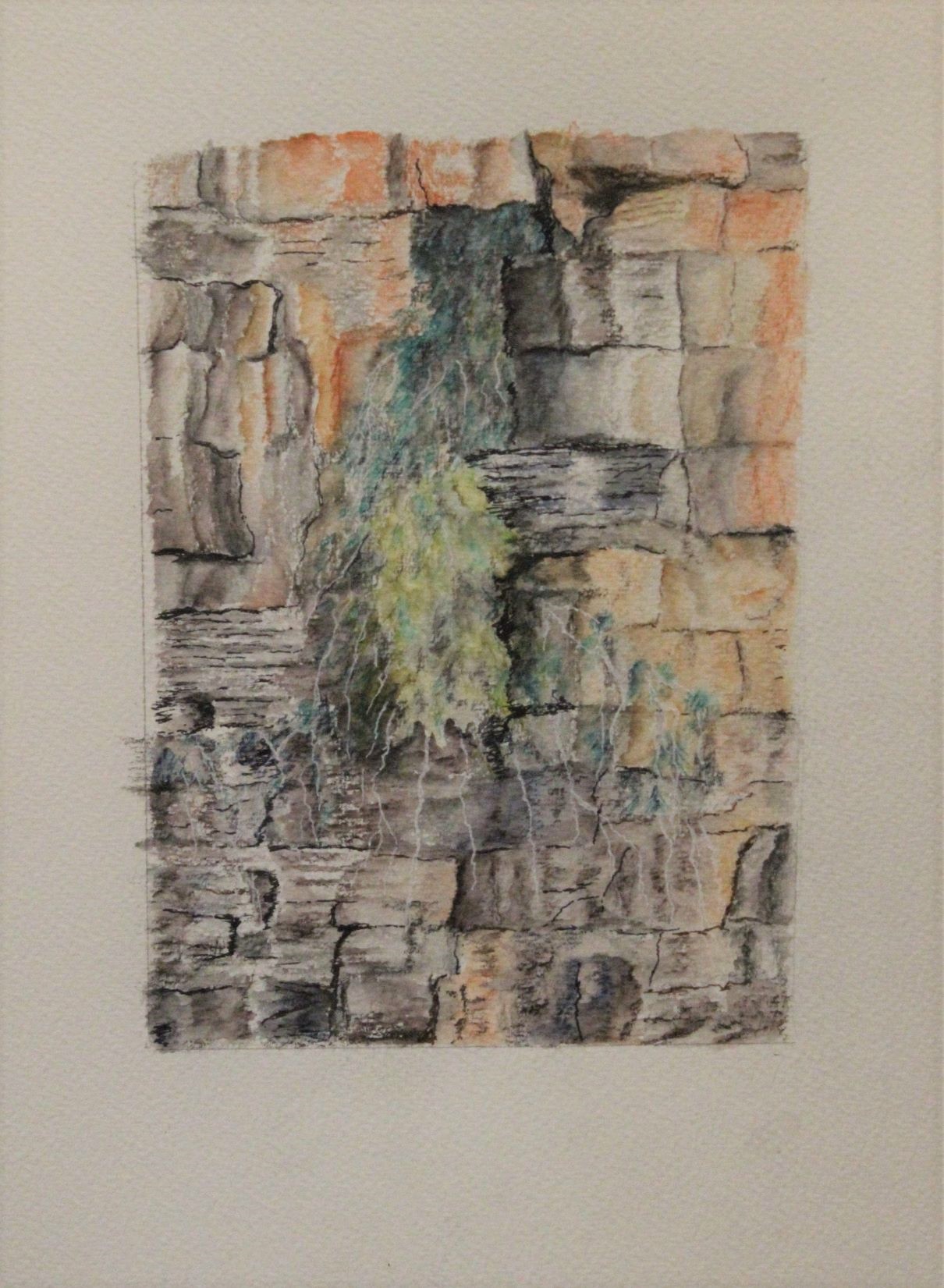
Jean: Cliff face, King George River

What a beautiful drawing this is Jean! Jean's inspiration for this work is a photo of the cliff face taken by her husband while they were both on a Kimberly King George River cruise last year.  There is an amazing amount of colour, texture and details in this work. Jean has used a variety of mediums - her words:

'I used Bockingford 300gsm cold press paper and the initial drawing was with a Derwent 4B Sketching medium wash pencil, which I then washed. I then used a mixture of Derwent Graphitint and Inktense, with some Staedtler Mars Lumograph pastel pencils, Adel black and brown Fineliner pens and a white gel pen.'

This work is almost abstract in design, but it is a totally natural form. The cascading green foliage brings a softness to the hard edges and rock strata - as well as introducing some contrasting colour. It would be good to see something introduced into the work to give us an idea of scale - a climber on the rocks, a nesting bird or the like. Without that reference it is hard to tell how large the cliff is.

A very beuatiful drawing, Jean. Don't forget to sign it! And frame it and show it!


'Cliff face, King George River' by Jean

*REMINDER* Monday night classes at the Victorian Artists Society resume July 13. Places are limited due to Covid 19 so contact VAS today and sign up if you wish to join in!