Sunday 31 May 2020

Drawing Prompt Week 6

Prompt: GARDEN

This week I want everyone to get outside and enjoy the last few sunny days of Autumn and draw in your journal something you love in your garden, flower, plant, tree, aniaml or even a gnome . Yes, this should be drawn from life, not a photo. If you do not have a backyard draw the potplants on your balcony or take a walk to the local park and draw there. Or even the cactus on your desk! The drawing should be in colour. preferably pencil but ink is fine too, and in your journal or visual diary. So this week, sit outside for an hour or so and enjoy the fresh air, sunshine and art!

California redwood trees - drawn from the deck of my sister's home in Marin. California. Graphitint pencils on A4 cold press watercolor paper diary

Monterey Cypress - from the hotel room deck of Asliomar resort, Monterey. Adel pens and water

Grevillea -  Bellingen, NSW, creek walk. Watercolour pencils and water

Today's sketch
In first term, when life was still normal, I asked MEG how to care for my Gaura plants that were getting a bit out of hand. She advised me to cut them back hard and see what happened - well, they grew back and are blooming wonderfully again. So I thought I would play around in my sketchbook with these colourful 'butterfly bushes'.

Using Inktense pencils I sketched in rough shapes of the Gaura plant and gently washed.

Once dry, I added stronger colour washes with the Inktense Pan colours.

When that was dry, I intensified the flowers with the Inktense Fuschia pencil and gently washed.
Then I blew it.


Using Adle and Statedler fineliner pens I tried to add detail. I didn't like that detail so I washed out the Adel pen and it became an unholy mess. I fiddled about a bit with a Staedtler green fineliner, the Adle black pen and a Shiraz colour Inktense pencil. This was the result.
Yuk, really. All I can say is what a mess.
Just goes to show you that not every work is a masterpiece or even successful! But the point was to be outside sketching and that is what your journal/visual diary is for, trying things out on the spot, experimenting and even failing. So get outside and make a bit of a mess!


Saturday 30 May 2020

Drawing Prompt #5: Tina and Silke

*Late to the party, but too good to miss!

Tina and Silke have sent in their works for Flight - and both have done a stunning job - and as they are other than birds I really think you should all see their efforts.

Tina
A beautiful Blue Banded Bee is Tina's submission this week. She has created this drawing on Bamboo paper using Inktense and Faber Castell colour pencils. Tina says she is: 'Not so happy with the grevillea or the wings or the composition...' but I disagree. A delightful drawing.

'Blue Banded Bee' by Tina

Silke
I will let Silke tell you about her work:
'My partner ...suggested the Wright Brother's Flying machine.... This is actually one of the later models, not the one they used for their first flight. I only used three coloured pencils (Polychromos) for this. In hindsight I should have scored most of the rigging so it came up as more white against the dark ground. Instead I used a little Chinese White paint to get some of the highlighted areas back.'
I think the Chinese White works fine - indenting can be tricky to get to work right. And your use of a limited palette works well for this subject. Fun to see this drawing, well done!

'The Wright Flyer' by Silke

*Please note, submissions are due by Friday evening (Saturday morning at the very latest)


Friday 29 May 2020

Drawing Prompt #5; KD and Rosalie

Flight!

KD and Rosalie have both sent me works late last night/early this morning and I think they both deserve a look at here because they deal with the concept of flight in a different way to the previous submissions.

KD
Here we have a drawing showing a version of flight not yet seen here on the blog - that of hot air balloon travel! KD has used pastels on a 160gsm rough surface pastel paper for her charming work of balloons lifting over the hills at sunrise. As a novice to pastels KD is still experimenting with how they work, feel and handle, but her unsophisticated handling of the medium suits the subject well.  She has captured the bright colours of the balloons, even noticing the yellow glow of the gas jets lighting up the bottom of the bag. The sun is rising in a pink sky lifting out of the edge of the mountain peaks. The placement of the sun gives the illusion that the balloons are soaring high and in front of it.
I would like to work with KD on her layering techniques when we return to class and demonstrate to her ways to build up colours with her pastels. The concept and desgin of this drawing is quite good - the ovals not quite right but a good attempt and the composition is working. The bright colours make this a cheerful work to view. Plus, it shows flying in a unique way and I appreciate how KD has thought of a different approach to this weeks theme. 

'Morning Flight; Up and Away' by KD

Rosalie
Using a family photo as reference Rosalie has created a dramatic and dynamic graphite pencil drawing of her neice feeding a seagull chips. She has used F, B and 4B graphite on Fabriano 300gsm Hot Press TW. The compositional balance of this drawing is just right IMO - there is a strong diagonal line of the child's arm linking to the gull. The outstreached wings of the gull are at a 90 degree angle to the arm creating a positive and negative space that interplays pleasingly. Rosalie has captured the somewhat anxious pose of the child holding out the chip - delighted to feed the bird yet also slightly fearful of getting her fingers nipped. The tones of the work are generally well balanced. I think the childs's arm is a touch darker than her face, but as this is a summer image we can assume she is well tanned and has been wearing a hat to protect her face! Rosalie has drawn the hair to look wet, as her niece had just been swimming, and this works well. Also, the girl's eyes in the photo were shut, so thet have been redrawn as open quite successfully. I find I am a bit confused at how the left wing joins the body of the bird - I think it should be darker and the body lighter to force the wing back. The shape of the bird pose works, it just needs that area refined with more information to detail the shape. 
Another pleasing and unique drawing of flight!

'Feeding the seagull' by Rosalie

Thursday 28 May 2020

Drawing Prompt #5; PenneJ, MP, Jean, JD

Away with the Birds

Well, it has been a quiet week - I guess it 'flew' by for many of you. But here are a few of the works that have been submitted.

PenneJ
PenneJ joins us for the first time this week with this drawing of a young figbird she rescued in her garden. The work is 20 x 20cm on Fabriano Hot Press in Graphite pencil with seclected colour. This is a good composition, the main focus on the bird in the lower left corner balancing out the space of the upper right. Your eye is drawn into and around the work natrually. The hint of colour around the head works nicely, bringing our focus to the eye. I would suggest a little more tonal contrast is needed in the dark areas. The darkest point on the work is the eye and I would like to see that same level of darkness used elsewhere within the bird's plumage.
The softness of the chick's fluffy feathers is well done, as is the the pose. I quite enjoy looking at this work - the image was a bit dark and I tried to lighten it up a bit so you could all see the great detail PenneJ has achieved in the feather work. This piece reminds me a lot of the stylistic works of   Hokusai - it has the same freshness and economy of line. She has taken great care to include a background as well; this frames the bird and gives it context to its' environment. A great first submission!

'Baby Fig Bird' by PenneJ

MP
This time of year the trees are filled with Rainbow Lorikeets seeking the early flowering eucalypt nectar, and MP has drawn one of the many visitors to her garden. Using A4 Art Spectrum 300gsm Hot press paper and Prismacolour watercolour pencils in a wash and dry technique MP has created a colourful rendering of this brilliant bird.  The intensity of hue of the Prismacolour pencils suit this work well. The arrangement and placement of the feather structure is well observed and detailed, especially across the upper breast area. Good proportions all over in a typical pose of this inquisitive bird. MP was concerned that the eye was not orange enough - I would suggest that next time to create this type of bright orange eye you begin with a layer of yellow, then add yellow-orange and magenta. For darkeness consider using a deep vermillion or violet rather than graphite or black. This is a well done drawing of a difficult bird, but I think MP could push the composition a little more. For your next drawing of this type maybe consider adding more interest to the branch by including some leaves, or branching twigs. But you can happily frame this one as it is!

'Rainbow Lorikeet' by MP

Jean
A portrait of a kookaburra preening was Jean's choice this week. He had just emerged from a dip in their pool and sat on the fence waiting for his portrait to be drawn. Jean has used graphite pencils HB, 2B, 4B on 300gsm Arches Hot Press. Once again I have to congratulate Jean on 'pushing the darks' as she has created a good tonal range from light to dark. The style of linework creates a soft feather effect - a few of the strokes are 'hooked' and you need to be careful of that, but quite effective overall.  I wonder if the beak needed to be a bit more substantial? Hard to say as the bird has its' head turned down and away so it is vanishing perspective. On the whole Jean has caught the pose well and it is certainly recognisable as a kookaburra! Did you consider adding a few drops of glistening water on the head or chest feathers Jean? As with MP's work above a little extra something would add interest to make a good drawing even better! 

'Preening Kookaburra' by Jean

JD
Our final submission is this distinctive Magpie by JD - he is standing there ready to take on the world! (or the next cyclist). JD has used her Windsor Newton visual diary 200gsm with Rexel Derwent watercolour pencils supported by Faber Castell B and HB pencil. I love that JD has tried to work in the environment of the bird with green washes in the background. She tells me she had some trouble with the paper buckling and balling as she tried to wash the Rexel pencils. Unfortunately this is a problem with the student brand of Derwent, but high praise for attempting it! Next time (with another brand maybe) try using some of the light yellow-green and light blue as well as the greens to create more natural colours.
The bird is great JD! I love his pose. Also the sheen on the head and the glint in the eye. Yes, you are correct, the beak is a bit too large in comparison to the body size, but totally forgivable as you have caught the expression so well. The feet are a touch small as well. However, as I said, the attitude and expression of the bird is very well captured. You have paid great attention to the ordering of the feathers and the details. I think you should be quite pleased with this result.

'Magpie' by JD

Hey all! Head over to Artaviso online virtual exhibition to see my latest work


Sunday 24 May 2020

Drawing Prompt Week 5

Welcome to Week 5


Officially the half-way point in Term 2, thank you to all who have joined in. Remember, if you have been 'lurking' you can join in at any time. You don't need to do a drawing every week (although it is great if you do and you get extra brownie points), but you can just draw the prompts that interest you if you like. And this weeks prompt is...drum roll please...

FLIGHT
Once again how you interpret this and in what medium you choose is totally up to you. But remember, it doesn't have to be birds. Many things fly, bats, insects, balloons, airplanes, leaves and dandalion fluff in the wind. So many choices!
If you choose to draw a bird however and want some pointers on creating bird shapes and how a bird works I can highly recommend John Muir Laws as someone you should look at. His website has helpful information and a great page on bird drawing here. There is even a printable worksheet! Remember, start with your basic shapes first, then work up the drawing from a solid foundation.

Build up your image from basic shapes - Fairy Wren demonstration

Experiment with a different medium this week perhaps. I have been drawing birds for many years, one of my first published drawings was this Black Honeyeater done in black ink on drafting film in a pointilism style way back in 1992.


Or perhaps you would like to try some white on black? This Cockatoo was drawn using white watercolour pencil, Faber Castell Pitt pastel pencil in white and yellow and finally soft white Art Spectrum pastel on Mi-Tiens Tex sanded surface paper. It was a workshop demonstration piece created in under two hours.


Maybe just some feathers? Watercolour pencils in wash and dry technique with Stadtler Mars graphite overdrawing on Lana Hot Press 300gsm paper. If you wish, send me an email via the contact button on the right and I can forward to you a pdf worksheet on drawing feathers.


But as I said above, it doesn't have to be birds! You can make ANYTHING fly!
'Blue Tacks' by Linda Weil 2019


Friday 22 May 2020

Drawing Prompt #4: MP, Jean, Monika and MEG

Four more great drawings!

MP
Let's start with MP's wonderful Prismacolour pencil drawing of her grandson Nicholas. This is done on A4 Artspectrum 300gsm Hot Press paper. MP has handled her pencils well, the layering and build up of the skin tone has nicely blendend hues and works very well. She has added just a touch of 2B graphite to add tone here and there as required but has not overdone it. All the shapes of the features are quite good. The mouth is nicely done - drawing teeth can be tricky but MP has used just the right amount of colour and shadow without making them look gray. The hair works, again good build up of different colours with the dark lines creating the shadows of the lighter hair. A touch clumpy in a few places but still quite well done and effective. The eyes individually are well done with just a hint of a sparkle and mischief to them.
The only real issue I have with drawing is the placement of the right eye. It is slightly too high - I have done a clip below showing where I think it should have been placed. Don't try to alter the drawing now MP, but remember for next time you do a portrait. In every other way this is a delightful portrait.

'Nicholas' by MP

Eye position correction

Jean
Jean has drawn a beach scene showing the simple pleasures of childhood, children building sandcastles. She has used Prismacolour pencils on Strathmore Tan Toned paper 180gsm. It is a brightly coloured and cheerful work and demonstrates Jeans style of drawing very well. Her loose and sketchy pencil strokes create shapes allowing the eye and brain to imagine the detail. Jean's style of drawing is very impressionistic, allowing the colors to build and make forms. I find it very effective. Jean tells me that she struggled to create skin tones and gave up on this drawing. Firstly, I don't think she 'gave up', but rather stopped at the right time. It can be easy too overwork Prismacolours. Secondly, not much skin tone was needed, the colour of the paper is enough - only the shadows and highlights of the skin should be drawn on this paper. Don't give up Jean! Try a few little trial sketches of skin on another piece of paper and experiment with how this could work.

'At Barwon Heads' by Jean

Monika
When Monkia was a child, her parents would read to her every night and when she saw this statuette in Japan it reminded her of her parents and the nightly ritual. She has drawn this in her visual diary (cartridge) using USA General pencils in HB & 2B. Sometimes General's have a problem with rough, scratchy bits in the core, but they are a lovely soft core pencil that gives a good, densely toned line. They are an excellent choice for drawing on a rougher cartridge paper - choose the best media for your surface! Monika has demonstrated this well in this drawing. Her linework and shading create an effective rendering of the statue. As her subject is black and it would have been tempting to 'fill in' a lot of the area but Monika has been restrained and concentrated on the highlight areas and deepest darks. This works very well and the drawing 'reads' as black to me. The style of linework is quite illustrative in technique and is very effective. What I really love about this drawing is that Monika has expressed her feeling and emotion of the figurine - she hasn't tried for a photographic copy, but has created an artistic interpertation of the subject which is endearing. Well done Monika!

'Reading' by Monika

MEG
This is 'Dogger', MEG's grandchildren's favourite toy.  MEG has used soft pastel on Mi-Tientes black pastel paper for this work.  She has used the pastel effectively to create a soft and fluffy impression of the pull toy. The face with it's black button eyes is engaging. MEG has cleverly allowed the black of the support paper to show where shadows and darker areas were needed. I would have liked to have seen a few more base colours under the light fur, pehaps some red ochres or violets and then topped over the golden brown with some of the brighter creamy yellow used in the string. Maybe some of that cream under the whites too. However, MEG has told me that she has been very busy this week and only was able to sit down to draw after 10pm last night for a few minutes before bedtime. So I think this is a little winner done with a limited palette of colours in a short time frame. It also demonstrates that we can ALWAYS find time for a little bit of art! Thank you MEG!

'Dogger' by MEG


Thursday 21 May 2020

Drawing Prompt #4: JD, Rosealie, Silke and me

JD

It seems a few of you are enjoying this week's prompt. That's great!
JD starts us off with delightful sketch of her son and daughter aged 5 and 7 in their school uniforms flashing cheeky grins that show off their missing teeth. Bet the tooth fairy had a financial crisis that week! lol. This has been drawn in the Windsor Newton 200gsm sketchbook using Faber Castell graphite 2H, HB, 4B, and B pencils. JD has done this drawing freehand from a photographic reference. She has done an excellent job with proporportions and placement of features. Hands are tricky and JD has resovled these quite well. She has a light touch and the suggestion of blond hair on the little girl is good- JD has allowed the pencil lines to create shadows of hair rather than making the pencil lines be the hairs - this works well. Fabrics are handled well with a lot of attention to detail.
 I find the eye shapes a bit 'pointy', remember JD, eyes are not pointed at both ends. Also, the tone on the lips is quite dark in comparison to the rest of the work. As this is linear sketch I think you could have just a suggestion of tone to express the shadow cast by the lips. Next time think of placement of your subjects on your page as you have run out of room at the bottom, but that is a very minor issue. This is a great sketch and it demonstrates real life and joy in the subjects. 

'Sarah and Will' by JD

Rosalie
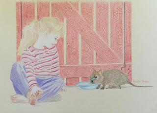
Rosalie joins us for the first time this week with two drawings. Her first submission is an older work from five years ago that she did for for a friend of his daughter greeting a quokka. This was drawn with Faber Castell watercolour pencils in the dry state on Canson Mi Tiens toned paper. Rosalie has captured the scene and the pose very well. I won't comment on technique as this is one of Rosalie's earlier works and I am aware of how much she has progressed since drawing this. Her ability is obivous in this older work and what is captivating is the child's pose. 

'Lili and friend' by Rosalie

Rosalie found she liked the concept of a child grasping her foot so she found another photo she had of her niece with a simialr pose. This an engaging composition created using primarily 4B pencil on Fabriano Hot Press 300gsm. This (and the above) is a freehand drawing and in both cases the proportions and shapes are well observed. Feet and hands are tricky things to draw and Rosalie has done a respectable rendering of the shapes. Baby hands are pudgy and she has tried to show this. The little toes curl and clench in a typically baby way. I am familliar with Rosalie's works and I have been advising her to push her tonal values. She has done that here to good effect. I like this drawing - she didn't give it a name, so I named it for her. I hope she approves!

'This little piggy...' by Rosalie

Silke
 Silke has drawn two childhood momentos of her own. A much loved, battered and balding teddy bear and a favourite book 'The Neverending Story'. Silke tells me she was a bit of a bookworm as a child - a kindred spirit! Using Creatacolor oil based pencils in sanguine tones she has created a freehand drawing from life. The soft sanguine and umber tones really suit the feel of this memory drawing. That teddy looks like he has had lots of love lavished on him! Cobbled stiching holds him together and his wee button eyes shine brightly. The composition is balanced and is effective. I think the perspective of the book shape is not quite right and this is accentuated by the slanted rectangle border. If the border had been more square the lower angle of the book may have worked better. Because the book angle lines up with the angle of the teddy's feet I get the feeling Ted is pushing the frame over. I am hoping that the photo Silke sent me was taken at a slight anle and the photo is slightly distorted, because this is a sweet work that packs a lot of emotional resonance for me. 

'Childhood Momentos' by Silke

Me

 To finish today's post, I thought you would like to see something I am currently working on. This is a WIP for the Artaviso challenge 'Door to Door'. I haven't quite met the deadline for their first intake, but will hopefully get it completed this weekend. Read all about it on the link - my page was about the manufacturing of toys. One of the toys is 'Bronco', a ride-on mechanical pony. This is the top right corner of my A4 drawing. Staedtler Mars graphite 4H to 4B on 250gsm Lana Bristol. And yes, the child riding Bronco is based on me at 7 years looking very annoyed. Probably at the terrible bowl cut my dad insisted on giving me. lol.

Detail from 'Toybox' by Linda Weil


Wednesday 20 May 2020

Drawing Prompt #4: JaneO

Everyone welcome JaneO!

JaneO has joined our little drawing group and I hope she enjoys drawing along with us all. JaneO tells me she has not done a lot of drawing before; she says she has done a bit here and there over the years but isn't overly familiar with many drawing techniques.  For this week's theme she has done a drawing of her niece Chole on her playmat. She has used Derwent graphite pencils HB and B and Derwent Watercolour pencils on Reeves 300gsm watercolour paper.
I must say I really like the bright 'buttons' of the playmat and how the strong colours contrast with the graphite work. It is striking and playful. JaneO has drawn Chole freehand (no tracing) and she has done a very good job with facial proportions. She has demonstrated a good grasp of the features, size, shape and position. One eye is a little larger than the other and the mouth is a bit skewed but the little face is quite sweet and I suspect looks a lot like the subject. I think this drawing would benifit from more tonal work in the graphite areas to build more form. JaneO has used some tone in the forehead and nose and here and there, but more could be used. This is especially needed in the collar of the romper suit to stop the collar blending into the head. I do understand JaneO's hesitation in adding too much tone tone to the romper as the Reeves watercolour paper is quite rough and difficult to work with in pencil. I would struggle to achieve tones with this paper so I don't want JaneO to fiddle with this drawing too much.  There is a danger of making the graphite areas look 'dirty' on this paper. The drawing works well and I think JaneO has done a nice job on her first drawing prompt! 

'My Niece' by JaneO

Sunday 17 May 2020

Drawing Prompt: Week 4

Theme: Childhood

This week's prompt is very open ended. The theme is 'Childhood' and you are invited to interpret that in any way and in any medium you choose. There is no limit to this prompt except that it must demonstrate in some way a link to childhood - yours, your children/grandchildren or any child.
Some ideas:
-Draw you or your child's favourite stuffed animal, tattered and torn, much loved.
-Draw a child's toy of any sort, or look into a toy box and draw that
-Do a portrait in Lego
-Draw a portrait of a child in any medium
-Go to the park/backyard and watch the children play and sketch them in action.

Play list: 'Be my Baby' - the Ronettes, 'Baby I  Love your Way' - Peter Frampton, 'Anybody Seen My Baby' - The Rolling Stones, 'Baby please don't go'- Muddy Waters, 'Baby did a Bad Bad Thing' - Chris Isaak, 'Rock Me Baby' - B.B.King, 'Its All Over Now Baby Blue' - Van Morrison.

Please - a request - send me your images and emails by Friday night - Sunday afternoon is really too late to post before the next week's prompt goes up on Monday.

Have fun with your second Childhood!
 Some samples:

'First Steps' in graphite by Linda Weil

'Steff' in graphite by Linda Weil

'Feeding Spoon' in graphite and colour pencil by Linda Weil

'Blue Marble' in Prismacolour pencils by Linda Weil


Drawing Prompt #3: Silke

Silke

This just arrived in my email and although it is late it deserves a look. Silke has drawn a collection of colourful leaves from her pear tree. It is a nice composition and brightly coloured. She has not told me what type of pencils she has used, although it looks like watercolour pencil in wash and dry technique. The build up of colour is quite intense. I do like the brightness and intensity, it is bold and full of drama. But the build up of colour wash is rather heavy which has created a some difficulty adding dry colour and tone onto the top of the wash. Maybe with that amount of intense colour wash little or no dry work was needed. I do think the heavy black shadow is far too dark and overpowering. I would suggest that a wash of dark blue or a soft graphite grey fade would have been more suitable. Still, this is a powerful drawing with great colour. 

Pear tree leaves by Silke


Saturday 16 May 2020

Drawing Prompt #3: M.E.G.

Acer japonicum 'Vitifolium'

M.E.G. has been doing a lot of garden clean up of leaves this past week and this is the leaf she liked the best.  It is an Acer japonicum 'Vitifolium' which Google tells me is a type of Japanese maple. She has used soft pastels on Mi-Teintes dark blue pastel paper to create this piece.
This is a well studied leaf, the shape is consistant with the species having a sharp ridged edge spanning out to a broad hand.  M.E.G. has worked quite quickly on this drawing, about 45 minutes. Working at speed has given the work a freshness and spontaneity  to it that is refreshing. The drawing is not overworked or fussed over. The build up of colours and bright hues on the subdued blue background make the leaf glow. I can just imagine an entire tree with these leaves creating a blaze of colour. Well done, M.E.G.

Acer japonicum Vitifolium by M.E.G.


Friday 15 May 2020

Drawing Prompt #3: Tina

Purple leaf

Tina's leaf drawing came late this afternoon - we should ask M.E.G. what species it is*, a Liquid Amber, maybe. Tina says the leaf was quite purple in hue and so she has tried to emulate that with washes in Inktense on her base drawing.  Colour pencil is used on top of the ink wash. She says that she didn't feel that the paper she was using worked well with the pencil, but hasn't said what type of paper it was. Apart from a certain graininess in the shadow wash I don't think the paper is a problem. Putting colour pencil on top of a translucent ink layer can be problematic as the pencil is often rejected by the ink and will not 'take' as well. Ink tends to smooth out the paper fibres reducing the paper surface roughness that grabes the pencil as you draw. That being said I think Tina has overcome this issue quite well, she hasn't pushed or forced the colour pencil but allowed it to work with the ink where it could. The leaf is a good shape and the hues and tonal values are nice. The greens blending to purple then fading to red and yellow is quite effective. The ink layers give the hues a fresh feel and the overlaid pencil tightens up the detail. It appears that Tina has also use a masking fluid** in the white veins and this also works very well. This is a nice, fresh drawing using mixed media successfully.
*Update: M.E.G. says she belives this is a an Acer platinoides. Or 'Norway Maple'
**Update: Tina says no masking fluid was used! So I am very impressed with her level of control of the medium.

'Leaf' by Tina


Drawing Prompt #3: Monika, JD & Jean

Three Artist's draw leaves!

Three of you sent me work late yesterday - I hope you all don't mind if I put them up in this one post. All three artists have done interesting work. Autumn has arrived.

Monika
Monika created her leaf drawing in her Visual Diary on cartirdge paper using watercolour pencil (no brand given), Derwent Graphitint and 2B graphite. She tells me she did not realise how quickly a fallen leaf would loose colour and dry out once inside! Drawing from life can have its difficulties, but  gives you the advantages of seeing the item in it's natural state, not influenced or distorted by a camera lens. Monika fears she did not succeed as well as she wished - I think she is being a little too hard on herself. The leaf shape is very good, the hues and colour transitions work very well. The indenting of the veins works well. Although the shadow is a bit darker than I prefer, it works well to lift the leaf off the page and give the shape form. 
I do believe that working on the cartridge paper of a visual diary has disappointed Monika somewhat. The graininess of the cartridge makes it difficult to work on, creating a rougher texture. Also, cartridge is not easy to work with in water mediums as it is so absorbant. In spite of the support used I think this is still a good observational drawing of a leaf.


Jean
Jean has done both challenges - the first is her Autumn leaf created using Derwent watercolour pencils with graphite shading on Arches 300gsm Hot Press. The leaf shape is good and the supporting graphite leafs create a good overall composition. The colour leaf has been slightly overworked. I suspect that Jean overwashed her colours somewhat and then did not wait quite long enough for them to completely dry before adding another layer of hue. This is quite a common trap and one I have fallen into myself quite often! However, Jean has quite a free and expressive style of drawing and on the whole the leaf has a nice loosely stylised effect that works very well. A note on the graphite leaves - some indenting has been done in the veins but it has not quite matched up to the line and shading in areas.  It can be difficult to remember where you have put that darn indent! 

'Leaf study' by Jean

Her second work is a maple tree study on Strathmore Toned Tan 118gsm paper using Staedtler Pastel Pencil Sepia set and Carbethello pastel pencils in maroon and yellow. This was the first time that Jean has attempted pastel pencils and I think she should be very happy with the result. She has instinctively realised that hue needs to built up in blocks of colour from light to dark. As well Jean soon realised the level of detail you can achieve with pastel pencils is not as fine as that of graphite or colour pencils. Instead she has let the blocks of color and tones build up to form the impression of detail creating satisfying leaf shapes with good colour. She has finished it off with some crisply drawn branch lines highlighted in white. The overall tree shape is good and the branching limbs 'grow' from the trunk in a believable manner. It could have been very easy to overwork this drawing, but she has held back and let the colours and line tell the story in an uncomplicated way. A lovely small work.
I really think that pastel pencils suit Jean's style of working and hope she continues to explore the medium.

'Maple tree' by Jean

JD
JD tells me that she found this subject harder this week and is not totally satisfied with the result. Again, I think she is another who is being too hard on herself! Using 300gsm Hot press with Derwent watercolour pencils and a 4B Faber Castell graphite she had created a very realistic looking maple leaf in autumn colours. Working with this technique of wash and dry on hot press paper can be difficult and it can be harder to layer. Her wash layer works very well, just enough dampness to the wathercolour pencil to blur and soften the colours together without getting muddy. JD was worried that she had overworked the drawing but I think she has just held back enough, creating translucent layers of colours that are accentuated by the dry colour and touches of tonal graphite.  I certainly think that her cast shadow on this leaf is the best of all the shadow work I have seen so far this week. The indenting on the veins with the assistance of the magenta linework gives just the right level of detail.
I would love to see JD explore this technique a little more in another drawing, experiment with pushing and pulling the colours in the wash state. Maybe adding some compimentary colour (blues, violets) in the dry work.  It doesn't need to be another leaf JD!  You've done quite well with this but don't stop now!

'Maple leaf' by JD

Her second work is a tree drawing in pastel pencils, and for her it was also the first time using this medium. She has used Art Spectrum Color Fix smooth Fresh Grey as her support and Faber Castell Pitt Pastels as a medium. The Pitt set she has only contains 13 colours which she has used effectively. The tree shape is very good, capturing the pollarded Birch well. As it was her first attempt with this medium she can be forgiven for 'outlining' individual leaves and colouring them in - I find a better result is achieved by creating splotches and blocks of colour first, then adding linework on top to give detail. Remember JD, you don't have to draw each individual leaf on a tree! You have recognised this in the trunk and branches and the white highlight there works well. The addition of dark blue or violet in both the trunk and grass would also help, but you may not have those colours in your set. Yellow and blue in the grass in upward strokes would create a more grass-like effect that a solid block of  horizontal green.
On the whole this drawing is a good, quick study of a tree in full autumn colours. The shape and colours are well observed, as is the bark on the trunk. As your first experimentation with the medium I think you have done well. I hope you continue to explore and push the medium more, pastel pencils are a lot of fun to use and are quite effective. Why not try that leaf again in pastel pencils?
Check out the video links below for some good demos in using this medium.

'Autumn Tree' by JD

Good video to watch - see how he uses his black! : Virtual Instructor
Colin Bradley is pretty good too.


Thursday 14 May 2020

Drawing Prompt #3: KM and MP

KM first!

KM is the first person to show her Week 3 drawing of leaves to me. As she is still at work during the lock down, she actually got up at 6am on Wednesday morning to draw a leaf - now that is dedication! Using a collection of Silver Birch leaves KM has done a very interesting thing with her work, she has drawn the life cycle of the leaf. Starting with a green leaf turning golden she has shown how the leaf progressess through the different stages slowly turning crispy brown. Clever!
This has been done on a 110gsm paper with Derwent watercolour pencils. I feel that the drawing would have benefited from a heavier weighted paper as her work has been affected by a few creases.
The silver birch leaves are well observed, showing the distinctive ragged edges. Also, she has thought about the way the leaves change colour and has linked each leaf to the other by including some of the previous leaf's colour in the new leaf. It would have been good to see maybe a few holes or torn edges in that last crispy leaf but the overall effect and compostion works quite well.
I like the idea of using shadows to give dimension to each leaf, but I find it a little distracting that she has used a different shading direction and technique for each shadow.
KM has created a very pleasing drawing with an individual and imaginative story. Well done.

'Autumn life cycle' by KM

MP came next

Not long after recieving KM's work, MP sent through her lovely drawing of 3 Autumn leaves. MP has chosen three distinctly different shaped and coloured leaves for her composition. She has created this on A4 Art Spectrum 300gsm hot press paper Prismacolour watercolour pencils and 2B graphite in a wash and dry technique.
The leaves are well observed and drawn with particular attention given to each individual form. They have been arranged on the page in a pleasing composition. MP's rendering of hue and execution of the colour transition on each leaf is very good. Her handling of the medium shows proficiency and sensitivity. The addition graphite helps the tone of the color harmonise and adds a good depth. I like the contrasting shapes of the leaves - each form is different and reconisable tree species. It appears MP may have done a bit of indenting as the veins of the leaves are thin and distinct without being drawn likes. This works quite well.
A very successful, well observed drawing.

'Three leaves' by MP

Sunday 10 May 2020

Drawing Prompt Week 3: May 10, 2020

Autumn

Challenge 1: A Leaf
This morning I looked out of my window to see that almost overnight the crepe myrtle tree had changed colour to yellows, golds and magentas. So this week I want you to take a short walk outside and find the prettiest, most colourful autumn leaf you can find and draw it.
Once again the choice of mediums is up to you, but I have done my examples in watercolour pencils with wash and dry techniques. You may want to try this in Inktense, Graphitint. graphite or regualar waxed colour pencils with or without wash or pastel/pastel pencil.
Note- especially for the pastellists- please scroll down to the second challenge demo.


First, find your leaf! This leaf drawing should take you at least two hours to complete, not counting drying time, if you want a good level of detail and refinement.
 Tape your paper securely to all 4 sides to your board, leaving no gaps (a 300gsm hot press is good for detail). Using water soluble pencils, lightly sketch the shape with a blue pencil then add some soft colour in yellow, red, magenta and violet - if these colours suit your leaf. Stroke in from the edges emulating the veins. Don't draw across the lobes. Avoid a strong or a heavy outline.
Then, with an Aquash brush or #10 standard round brush, gently stroke the colours letting them blend slightly. Again, stroke in from the edges and do not over work or over mix the colours. Dry the paper completely.

Once dry, add addtional dry colours as appropriate to your leaf. Here I use orange, yellow, yellow ochre, magenta, purple and blue. Using just the tip of the brush, stroke the colour again and let dry. 

Next using colour pencils as a dry medium , use a circular fill to begin to build up more hues across the leaf. Try and leave lighter areas for the veins if you can, but don't make them too thick or clumpy. You could also try incising the vein lines now with a knitting/crochet needle to help you keep fine light lines.

Keep adding and building up the dry colour. If you think it needs it, selectively touch with a wet brush here and there. Be careful not to wash all the detail away.

Add graphite to create tones and shadows. In this work I created graphite only leaves to frame the coloured leaves.

You can also try this in Graphitint pencils, although the colours of Graphitint are quite muted and you will not get the vibrant oranges and pinks of watercolour pencils

Another example

And yet another.

Your Week 3 play list: Eva Cassidy 'Autumn Leaves',  K.D. Lang 'Miss Chatelaine', John Coltrane 'Autumn Serenade', Van Morrison 'Autumn Song', Tom Waits 'November', Ella and Louis, 'Autumn in New York, The White Stripes, 'Dead leaves and Dirty Ground',  and one of my personal favourite Van songs, 'When the leaves come falling down'. 

Challenge 2; Autumn scene in Pastel Pencil
Why not draw a complete Autumn scene? Pastel Pencils are great to work with, quick and with intensive colour. You could also use soft pastels. For the following I used primarily Carbethello Pastel Pencils and finished with a Yellow and Orange Rembrant soft pastel. This was done on Art Spectrum Colour Fix Smooth A4 paper, burgundy hue.  Each photo has the pencils used for that step on the left side so you can see what I used to create each step. Remember, these colours and pencils are just suggestions, feel free to do it your way in the medium of your choice!

This is the view from my studio to my Crepe Myrtle tree.


 The finished work.
Have fun! I look forward to seeing what you produce this week.