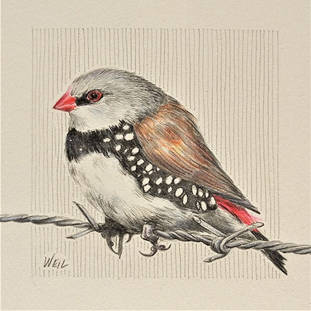
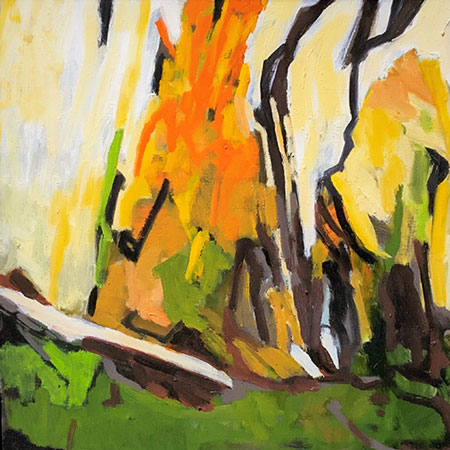
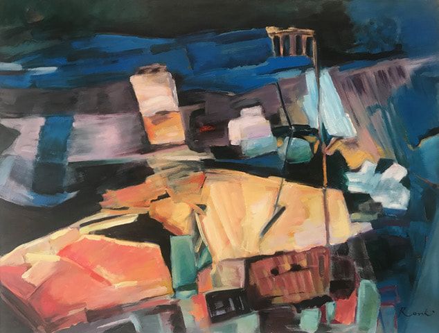
As well as the MEDALLION exhibition at AGRA, VAS is holding several well-worth-a-look exhibitions during December. Come along and visit, there is no entry fee. If you haven't seen the VAS gallery since its' renovation you must see!
|
|
|

|
|
|
|
|
|
|
|
|
|
|
|
|
|
|
|
|
|
|
|
|
|
|
|
|
|
|
|
|
|
|
|
|
|
|
|
|
|
|
|
|
|
|
|
|
|
|
|
|
|
|
|
|
This weeks' prompt gives you a lot of scope, and here are two great interpretations of 'Point'.
Monika has used the concept of a geographical 'point' , specifically Cape Regina, the most northerly point on the north island of New Zealand. She has used Rotring 0.1 and 0.3 pens in her visual diary to create a strong graphical image of this squat lighthouse.
This lighthouse has a somewhat tricky shape, with six flanged support columns. Monika's use of hatching works well to show the shading and form of these. The perspective curves on the light and walkway are a little wonky but add to the charm of this drawing. The single horizontal line simply states the horizon, but I don't think the wiggly lines in the ocean were needed. Including the sign post was a good call as it gives us an immediate indication of the scale of the building. It is good to see how Monika is developing her inking skills and ability with hatching - I am enjoying seeing these ink drawings each week. This drawing captures the scene well and as Monika says:
'I like the way the chunky little lighthouse hunkers down on this very remote and very exposed spot. Imagine the wild storms that would come sweeping in here!' Monika

Silke has been doing a fair bit of life drawing during the past few months and she has put this to good use in this drawing of a ballerina. Swift color pencil line work has been used to relay the sense of movement in this drawing. Done in her sketch book it is a work that has captured the gesture and the power of the dancers pose. An imaginative reaction to the prompt executed in a dramatic and dynamic style that works well in design and composition.

Pop this one into your diary! I am intending to be at the exhibition in the afternoon of December 2 if you would like to catch up. Also, if you are looking to find a unique Christmas gift or two, the AGRA gallery has a fantastic new shop featuring cards, jewelry, art, prints and more. Hope to see you there!
2020
Medallion Exhibition
December 2 - 18, 2020
AGRA Galleries

●
Roz McQuillan – 2019 Medallion Winner
● Linda Weil – 2019 Terry Collins
Award
● Pamela Pretty – 2019 Best in Show
Featuring
The Spoon Collection
by Linda Weil
Art
Catalogue of the Spoon Collection available for sale at the exhibition
1 Inglesby Road, Camberwell
p. 9882 5859
Hours: Wed – Fri 10-4, Sat & Sun 1-4pm
A late submission from Monika, but too good a work and composition to not show you. Created using a Rotring 0.01 pen in her visual diary she has captured the patterns and shapes of power lines and towers in the sky. As she says, they reminded her of Triffids marching through the countryside.
You did this very well Monika - the composition is very effective and your ink linework is quite good - the scrumbling and hatching effect on the ground works well. And the line from 'Wichita Lineman' sets it off wonderfully.

All being well for 2021 and we continue to be Covid free, classes will resume next year at:
Victorian Artists Society
1 Feb to 22 March
Monday Nights 4 - 6.30pm
Bookings open Nov. 26 HERE
Mentone/Mordialloc Art Group
Dates TBC
Beginners to Advanced Thursday evenings 7.30 - 9.30pm
Beginners to Intermediate - Thursday afternoons, time TBC
For more information and to register your interest contact MMAG HERE
(MMAG is volunteer run and phones are not manned every day, leave a message and your phone number if you do not get a reply.)
Please note that I am not returning to Camberwell Community Art Centre, my apologies to past students and I hope you will consider one of the alternative classes above.
This could be anything from a pointing finger, to a point of a nail, a point on the map or even a landscape drawing of Point Lonsdale! Have fun.

Very creative works coming through for this weeks extra difficult prompt - well done!
Reminder: please name your files correctly for me, YourName_WeekNumber. Please don't write a long title or leave it as photo numbers.
A very good take on the barbed wire theme, Jean has expanded the concept by including the weathered wooden framework of the old gate and fence posts. Jean has used Baohong 300gsm cold press paper - I am not familiar with this paper but it looks nice. Some info on the paper HERE. She has used the Derwent Sketching W/S pencils medium and dark to create the soft tones in the fence posts, added some Staedtler Sanguine pastel pencil for the rusty hinges and finished off the wire with a sharp 4B graphite pencil. Looks good Jean!

Two very creative submissions by EM. She has thought outside the box a bit and found a different examples of wires around her home. Just what I was hoping for!
Starting with a mini wire whisk done in graphite HB, 2B, 3B, 6B on A3 Canson 110gsm paper. Beautifully observed, simple drawing with lovely backlighting that creates a wonderful shadow.

Her second drawing is of a Venetian glass earring in Prismacolor pencils done on some 90gsm printer paper. A pretty little drawing... and, how many times have I said to you all to use better paper even if you are just fooling around? As you will often be surprised at the great work you create but saddened that it is on paper that will not keep. Oh, well, its a lovely drawing anyway EM.

MP has chosen a very tricky subject, but once again proves she is up to the challenge and delights with her drawing. How many of us have seen this style of wire gate in our neighborhood? Her attention to detail and exact shapes is excellent. Created on 220 Canson drawing paper with an HB underdrawing, the color work is done in Prismacolor pencils. MP has highlighted the fence wires with a Signo white gel pen and then created sharp black shadows on them using an 8B pencil. Very nice drawing MP!

KM loves trying out new materials and this week she has attempted charcoal for the first time. She also has a fun twist to her concepts and this week is no exception. During her walks around her neighborhood she has noted how people used fences to stay inside or to keep out the world - and how sometimes the fences were breached letting in the world. Created as a quick 30 minute sketch she has used 2B and 4B charcoal pencils on a 110gsm paper. A good concept drawing KM.

A tricky one for you! But it actually has a lot of potential. A few ideas for you:
Abstract design of Telephone wires crisscrossing the sky
Wire frame drawing of a figure or animal
Wires of a puppet
People connected with wires
The colorful mess of wires in a junction box
Barbed wire
A forest of wires
Portrait of someone really wired before their coffee (okay, a stretch)
Fishing wire (line)
The wire ring of your sketchbook
Or... a bird on the wire!
show me what you can come up with.

She enjoyed the Inktober prompts so much Silke has set herself a personal challenge to do regular drawings that illustrate the letters of the alphabet! Done in color pencils this is a sweet little work that fits the category of Small: B is for Bee.

This drawing by EM is one that I am really pleased to see. EM has thought about the prompt and created a work that shows 'Small' in relation to the environment around it. So rather than just drawing something 'small' she has created a scene that tells the story. EM says:
Created on 110gsm Canson paper with 3B, 6B and Prismacolor pencils this tells a story in a good composition. The darker colors force the small building forward and to our attention. A nice work EM that explores the prompt theme beyond the obvious.
(ps. EM sends kudos to KM who grabbed small stuff right in front of her for her drawing)

From little things big things grow... and MP has found these small gumnuts in her local park to draw as her work. She has used Canson 300gsm HP, starting with a HB graphite under drawing, then a wash of Prismacolor pencils in Olive Green and Sunburst Yellow. Also used was Derwent Graphitint Ivy pencil. Finally JM finished the detail in Prismacolor Premier pencils.

In her visual diary using 2H, F, 2B, 3B and 4B pencils Monika has created a composition of different angles and shapes formed by two of her old pencil sharpeners. These sharpeners are tricky to draw - they look simple but they have all sorts of strange angles and curves. Monika has observed these shapes well, drawing them about 50% larger than life size. The position of the sharpening hole on the angular one is not quite correct and I find that a little annoying as all the other angles and curves are more accurately drawn. But that being said, this is another clever work demonstrating Small by using everyday objects you find around you. I hope you have time to finish the work with a bit more shading Monika as it is a good piece. Why not add a bit of curling pencil shaving for added interest?

Jean has used 300gsm Arches HP paper for this little gem. Beginning with Derwent Sketching (watersoluble) pencils in dark and medium washes for the wings, she then added some Graphitint Dark Indigo to make them tonally darker. I am glad she didn't just add black pencil here as this result has more depth to it in the dark tones as a result of this technique. For the blue markings she has used a mix of Derwent watercolor pencils and Graphitint. For extra highlights a Stabilo Carbethello white pencil with some white gel pen has been used. This mix of pencils has created a shimmering look to the butterfly - you can sense she/he is enjoying the bright sunlight. But as I pointed out to Silke above... where are his six legs? A pretty little drawing, Jean.

Blackwing pencils have been around since the 1930's when they were manufactured by the Eberhart Faber Pencil Company. The original Blackwing pencils were discontinued in the 90's, but in 2010 a California based pencil manufacturer purchased the Blackwing trademark and reissued the pencils under its' Palomino division. From all reviews I have read these new pencils are exactly the same as the originals made in the 30's. WikiLink
Blackwings are possibly the most famous of the 'high-end' pencil you can find. They have been used by writers such as John Steinbeck and musicians like Stephen Sondheim and Leonard Bernstein. My favorite animator, Chuck Jones who created Bugs Bunny and Looney Tunes characters swore by them. I remember my Dad used one and as a child I loved the strong black mark it made - but he didn't let me use it often! So when I saw that Pencilly were selling Blackwing pencils I couldn't resist buying some. Unfortunately they had sold out of the 4 sampler set so I purchased a Palomino Blackwing Legacy Branded matte black and a Palomino Blackwing Natural. (4 pencil sets are now back in stock).

The first thing you notice is that the pencils are slightly longer than standard. The extra length affects the balance slightly if you are used to using a standard pencil or a shorter clutch pencil. Don't worry, you soon adjust and anyway, you are going to sharpen it shorter soon enough. At this larger size they don't fit into a standard length pencil box; as I said this will be sorted out over time.
The pencils have a hexagonal body with a graphite core encased in wood. The Natural has a cedarwood casing which smells lovely when sharpened. Each pencil has a gold ferrule on the end that holds a rectangular eraser - and the eraser works well! Erasers are replaceable and come in different colors, but I tend not to erase too much so replacement shouldn't be an issue. Nice to know though.
The lead in these pencils are wax based, so they have a smooth and velvety feel. No crunchy feel in the leads, but a creamy, flowing line. Don't let the idea of wax put you off, they still sharpen and hold a point well. The lead is not brittle and doesn't break when sharpening. One confusing thing I found is that these pencils don't follow the European grading system of H to B range. As all the Blackwing pencils are considered 'soft' you can take it as a given that there is no 'H' or harder version. You will need to read about them before you purchase and once you own them do test sheets to discover how soft or hard they are and how they compare to a standard graphite pencil.

You can see from my test sheet above that the Blackwing gives a good, dense dark coverage. I used my standard Staedtler Clutch pencils as a comparison and found that the Natural is slightly darker than the HB, more like a B, and the Matte Black is very close to a 4B. As the Blackwings are wax, I thought it would be good idea to test it against a few waxed color Prismacolor pencils and compare to using with standard graphite and against Karat waterrcolor (unwaxed) pencils. They seemed to blend better with the Prismacolor pencils than the Karat or graphite and with less smearing. Additionally they are darker in tone so create better blacks.
If you are really into collecting pencils, Blackwing introduced the Volumes series in 2015. Each quarter they bring out a limited edition pencil celebrating an artist, writer or special event. These would be great fun to collect and display, but I would be too tempted to use them for drawing!
Speaking of drawing, to test out these two pencils I did a quick sketch of a hibernating Pygmy Possum using the Matte Black, Natural and Prismacolour 1070 pencil on 210gsm Art Spectrum drawing paper. 10cm x 10cm so it also falls into our 'Small' prompt for this week.

I love the way these Blackwing pencils feel and draw! Smooth and velvety the marks they make are almost sensual. The smooth lines, rich blacks, high quality material, feel of the pencil, usable eraser all make this a pencil to consider including in your arsenal. Will it ever replace my beloved Staedtler pencils? Not for the finer detail drawings I like to do where I really prefer a hard pencil, but for sketching, travelling, use with Prismacolor pencils I think it will be a tight race. The price of these pencils are slightly higher than standard brands, but the quality is well worth the price. Give one a try and let me know what you think.
*Note, this review is a personal opinion and I am not paid by any particular brand or company for these comments.
How wonderful is today?! Beautiful sunny spring in the Southern Hemisphere topped off by Covid restrictions easing off. We can now travel out of Melbourne! How great is that, well done all of us to get this thing under control and bring our numbers down to double donuts. 🍩🍩
So I know many of you will be outside celebrating, but don't neglect your drawing board. An hour or two once a week will keep your pencil muscles toned up and keep you in condition to return to classes in 2021. Just like KM has done with her submissions this week.
For her first drawing, KM raided the junk drawer and found small silver items under 8 cm. She has used a 110gsm paper with Derwent silver grey, gunmetal grey and metallic silver and pewter, backed up with Staedtler pencils. With these pencils KM has captured the shine of the metal well, observing the tonal contrasts. I especially like the bulldog clip and how it is drawn - nice lost and found edges create the shape without resorting to an overstated outline.

KM's second drawing went smaller scale. She has used a Staedtler F and F5 (?) as well as a Musgrave Genuine Tennessee Red Cedar Graphite which is lighter in tone than the Staedtler pencils. Remember when I told you all about the Pencilly website? Well KM purchased this Cedar pencil just to see if it does smell nice - and it does!
This is a nice composition of three different paper clips. I love the concept and the design works well. Its a great little drawing, and as I said above, use of high contrast tone married with lost and found edges create interest and metallic shine. Good work!

AGRA Medallion exhibition should be going ahead in December - watch this blog for final details, hope to see you all there!
Neil Wallace Printmaker supplies in Fitzroy is having their annual sale HERE. You can pick up some real savings on quality paper. They deliver and have great products. I like to buy in bulk - but if a full pack of 10 is too much for you why not get together with a few of your classmates/art friends and split the cost. It can be up to 30% off on some papers! Bargains galore - I recommend P326.08 Fabriano HP 300gsm white.
Not to bang on about it, but DO have a look at that Pencilly website. Christmas is just around the corner and I am sure you can find a gift or two for yourself or an arty friend. Plus it is just darn fun to look at all the pretty pencils.
I have really enjoyed seeing all your works for the Inktober challenge. Also, I was impressed at the different interpretations of each prompt as well as the techniques used. Really creative works, well done to all who participated.
For Week 25 we I am returning to our single word prompt - you can interpret this in any way - whatever first comes to mind when you think of the word 'Small'. And as you have all been restricted over the past 5 weeks to ink only I am throwing this one open to all drawing mediums. So whatever you want to puddle around with; ink, charcoal, pastels, colour and graphite pencils - whatever you want as long as it is a drawing medium. Have fun!


