Wednesday, 4 November 2020

Week 24: Jean & MP

 Two more Final Inktober Prompts

Yay! I have a new laptop! Still sussing it out, but lots of fun. Two excellent additions to the final Inktober lists:

Jean: Shoe 

Jean chose 'Shoe' as her prompt subject this week and decided to create a work of her niece's ballet shoes. This is a great subject and really extended Jean's experience in creating the shine of material and ribbons.  She quickly learned that to give the impression of shine you need to keep white highlights and deep blacks - how the values are used generates the effect of shine. Jean has done this quite well with the curing ribbons. I think some light tone is needed inside the shoe, but overall as a first trial the shoes are pretty good and look like satin material.

The floor/background is not quite right - a little too dark. As Jean said, once you put that down in ink you are stuck with it! I think a little more thought first on what a polished wood floor would look like would have helped Jean understand how to approach this. Remember the reflections in a polished floor.
But a good try.

'Ballet Shoes #1' by Jean

So, not happy with that first attempt, Jean went online and found an image that informed her better on the floor effect and I think this works much better. Also, having done the first work I can see that Jean gained confidence in handling the ink washes needed for the satin effect. A bit of black outline on the instep also helps to give the edge a crisp look. Nice use of lost and found edge as well. This work is fresh and states simply the subject.

Both drawings are good studies - and it is great to see the development of technique from the first to the second.

 .
'Shoes #2' by Jean

MP: Ominous

And a very ominous sky it is! MP has also been growing in confidence with her ink work and this week she has experimented with further techniques very successfully. Using Art Spectrum 300gsm cold press paper to give her a textural effect she has started with an under drawing in HB graphite. Next, using Amsterdam acrylic ink she has applied different tonal strengths of wash with a sponge and a brush creating a cloudy sky. With different Derwent Graphitint pencils used wet and dry she has defined the sky, trees and hillside. Then a black Unipin fine line 0.1 pen was used to emphasize the trees and foreground - and wisely MP decided not to use it in the sky. This was a great decision as I think pen in the sky would have ruined the lovely textural effect she achieved with the sponge work. Finally, a few highlights were added to the sky using Signo white pigment ink pen.

What can I say? I think it is a fantastic result! I love how MP has captured the ominous and threatening nature of the sky. The more detailed linework on the trees and foreground works very well and brings them forward. A fine work MP.

'Ominous' by MP


Monday, 2 November 2020

Week 24: Silke, EM, Monika and KM

 Final Inktober prompts

Just before we start I need to advise that my replies will be delayed for the next week or so as I am having some computer issues and am unable to post as often as I have done previously. Please be patient, I will post your work when I can. To start our final week from Inktober:

Silke: Crawl

Silke has done every prompt for Inktober (!!!), and she has at last reached the finish line! A clever little take on the prompt 'Crawl' as she crawls across that line. lol. This is a great little composition and quite dynamic. I love the slightly desperate look on the runners face.  Silke has spent the month trying different techniques and new materials and it has been fun to watch her develop these on her instagram page. HERE

'Crawl' by Silke

EM: Inktober selection

EM has just found us! She has been doing a lot of Inktober on her own and I thought I'd show you a few of the works she has created. These are all created with a Sharpie fine line texta, some watersoluble crayon to create grey wash effects in a Holcroft 225 sketch diary. These works span the month of prompts and are delightful. I welcome EM to continue with us in our prompt series this term.

'Fish' by EM. 

'Float' by EM

'Ominous' by EM (reference to Brown's Angels and Demons) by EM

Monika: Shoe

Monika was inspired by the cover of the book she has been reading 'The 3 Inch Golden Lotus'. She has used InkTense Pencils to colour and wash the bright colours after first sketching the image in HB pencil in her A5 visual diary. Then Monika has used a Rotring Graphic 0.1 to outline the image. A Pentel Sign pen for the black and very fiddly background. Finally InkTense pencils dry to highlight the flowers.

This is a beautiful shoe, and we can appreciate the elegance of the design and craftmanship although as Monika found, we cannot forget the pain of the custom of foot binding.

'Shoe' by Monika
(sorry Monika, but I do not have full computer functions to turn the image)

KM: All three prompts in One!

KM has cleverly combined all three prompts into one image, Shoe, Ominous and Crawl. Created in her 110 gsm sketch pad with Faber Castell pens: brown, orange, purple, pink and grey. Derwent pencils were used on the bricks. KM has discovered how much fun coloured pens are to work with - and also the need to be bold when using them. I love the use of bull ants to illustrate both Crawl and Ominous.

'Ominous Heels' by KM


Thursday, 29 October 2020

Week 23: Jean, MP & Monika

 Inktober Week 4 Prompts


Jean: Buddy

This lovely minimalist drawing from Jean perfectly sets off two 'buddy' seagulls basking in the sun at Glenelg Beach. Created with washes of Windsor Newton ink on 300gsm Arches hot press paper it is understated but works perfectly. This is a great example of showing how you don't need to draw every feather or detail to capture the essence and character of the bird.

'Buddy' by Jean

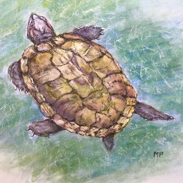
MP: Float

MP chose an excellent subject for her drawing to represent Float, that of a turtle she saw while at the Singapore zoo. Her method is to use Canson 300gsm hot pre ss paper with a light underdrawing in HB graphite pencil for form and structure. Then, with a brush she has applied washes of Sennelier ink in different shades to achieve luminous colours. Finally detail is added using a Unipin Fine Line black pen 0.1 and a Signo white pigment pen for highlights.

Her result is delightful!

'Float' by MP

Monika: Buddy

Using a KAWS sculpture as the inspiration for her work Buddy; Brian Donnelly's 'Companionship in the Age of Loneliness' HERE.  Monika has sketched it lightly in HB then shaded and lightly washed with Inktense Indigo and Sea blue. Using 0.4 fineliners in black and blue she has worked over the top of the Inktense washes. Monika says she found the fineliners reacted in a surprising way over the Inktense and was not happy with the result. I don't think it is that bad, it is an experiment and challenging to attempt. Perhaps mixing the two colored pen crosshatching together might have worked a bit better - so a little blue in the black and a little black in the blue. 

Drawing with colour inks can be a challenge, but also rewarding. Experiment and practice, look online for different techniques to see how other artists such as MIKE LYON  or JEAN HSU approach it. Full marks for giving it a go - don't give up on it Monika!

'After KAWS' by Monika

Monika: Blade (week 20)

Monika has also submitted another work from week 20 prompt, Blade. Pyle was one of America's foremost illustrators -he loved Arthurian tales and pirate stories and he is in fact the instigator of our common idea of what a pirate should look like. In this work she has referenced Howard Pyle's drawing of King Arthurs sword Excalibur. Monika has drawn a beautiful interpretation - her attention to the fabric folds and details in Excalibur is very good. The use of horizontal hatching in the background to suggest Arthur approaching in a coracle is unique and I think works well. A very nice drawing Monika, your ink work has really progressed over the past 4 weeks.

'Excalibur' by Monica. After Howard Pyle

By the way Monika, I have really enjoyed how each week you have brought to our attention different artists/illustrators who used ink and etching in their work. These have all been favourite of mine and it is wonderful to review their works again - thank you!


Week 24: Inktober Prompts 5

 Last  Inktober prompts

Just three more easy prompt ideas to finish off Inktober! Next Thursday we will return to pencils.

Also, I have a few works from last week to yet post, which I will try and do tomorrow so if you have been waiting I haven't forgotten you, just been occupied with other things.

Prompts:

29. Shoes
30. Ominous (something for Halloween perhaps.? L)
31. Crawl

Monday, 26 October 2020

Week 23: JD, Silke and KD - Week 22: Monika

Inktober Week 4 

Only one more week of Inktober to go!  There will be only 3 prompts on Thursday to finish up the list - so if you choose, like Monika did this week, you can pick a subject from any other week. Just make sure you tell me which prompt it is.

JD: Dig

JD has done a lovely collection of old gardening tools to represent the prompt Dig. Arranged on the page companionably the design resembles an old style print. She has used a black Uni Fineliner 0.2 pen to create defined and strong outline drawings of the tools. Then she added colour with a Prismacolor pencil watercolour wash in Terracotta and Goldenrod. To finish up JD has added shading with a Staedtler graphite 2B and HB which is very effective.

I think the design of this works quite well and the contrasting sized tools balance the space nicely. I like the outline effect and the use of colour and graphite shading. Perhaps some thicker/thinner linework and extra crosshatch shading in ink would enhance the work further. As it stands it is a good drawing, well done JD.

'Dig' by JD

Silke: Buddy

Mr. Bulky and his buddy are back this week! Silke said she wanted to do something light hearted and simple this week and this work achieves that beautifully. It's a rather touching little drawing, simply done with a sweet sentiment. And now with the great news that Melbourne is opening up again we can all go visit our buddies at last! Don't forget to see Silke's instagram page HERE for her complete Inktober works. Mr. Bulky and friend make a few other appearances. And there is a great ant's nest drawing!

'Buddy' by Silke

KD: Music

A 1967 Firebird V Gibson guitar is KD's response to the prompt Music. She has used a photo from the book 'The World's Greatest Electric Guitar' as her reference, and she has included the 303 logo from her favourite bar/musical venue. As a little nod to the 60's she added a peace symbol to the guitar body.The guitar body is done in Faber Castell pens - her brand new set - and although she originally planned the drawing to be all done in ink the 12 set did not have quite enough colours. So she has added some Derwent colour pencils and Derwent metallic pencils. 

This is a well thought out composition. It is great that KD has added her own design elements to the work and not just copied the original photo. It's a fun drawing and that is one hot Gibson!

'Music' by KD

Week 22 - Monika: Outpost

Monika has submitted two excellent drawings for the previous weeks prompt Outpost. The first was created using her Rotring pen 0.1 in the A5 Visual Diary and is a very successful work. I will let her explain her process:

When I think of an 'Outpost', I think of stories I grew up with like 'The Alamo'. I found some very nice photos on the internet, and also a youtube demo of an ink drawing by Igor Lukyanov, which I followed / copied and attach below.  The whole demo was accompanied by a rather charming song called "To the Men of Alamo", which sounded strangely familiar even though I'm sure I've never heard it before.

The YouTube video can be seen HERE

'Outpost: The Alamo' by Monika

Monika's second drawing shows a lot of creativity - she is building on all the lessons she has learned over Inktober to create a great interpretation of a photo by the Australian War Photographers Lyndell Brown and Charles Green. Her only reference was a very small image - the actual photo is quite large. Monika has again used her Rotring 0.01 pen and this time added light colour with her Faber Castell Classic Pencils in the WN A5 Visual Diary.

The drawing depicts a Afghan Outpost in Helmuth province that was cobbled together from old containers, barrels and office furniture. Atop this makeshift structure are two Afghan soldiers watching the Taliban forces gathering in the hills - they knew their situation was dire and they would be dead in a few days.

Monika has kept the drawing very simple and rather flat, to better emulate the haunting image of the doomed soldiers. The stark black, thick and thin lines and subtle hatching works really well. She has successfully taken the elements from the original photo to create a simpler version that loses none of the impact. This subject has been handled with sensitivity and compassion. 

'Afghan Outpost, Helmut Province' by Monika after Brown/Green

Original reference


Thursday, 22 October 2020

Radio Interview

 Interview on 88.3 fm

The interview was broadcast this morning on the Friday Magazine show - Leanne did a wonderful job editing out all my stammers and stutters. You can find it here for a week, until next Friday, October 30.

88.3fm - podcast here: https://www.southernfm.com.au/show/friday-magazine/

click through to 39.9 for the start of the interview

Week 23: Inktober Week 4

 Inktober 4 prompts for Week 23

22. Chef
23. Dig
24. Buddy
25. Hide
26. Music
27. Float

*Please note*
I am currently having some computer issues - please send your work in but understand that there may be delays in reply.

JD for Week 22: Sleep

I recieved ths lovely bedroom scene from JD late yesterday. Created on A3 Eraldo Di Paolo 300gsm HP with watercolour pencils Prismacolour and Derwent. Ink in Uni Fineliner black 0.2, Light grey 0.1 and Sepia 0.1. 

JD says she was tempted to add some in shadows but was a bit scared so left it as this clean, white image. She also feels the doona needs more work. My feeling on both these issues is to leave the work as is - it is looking good. The light pencil wash shading in the walls gives enough tones and sets off the white doona well.  The clean lines are simple and elegant - it is minimalist and this is succesful. I don't think you should touch the doona, it works as a white space and draws the eye. However, if you wish to learn more about folds and fabrics study some Durer prints for ideas.

'Sleep' by JD


Wednesday, 21 October 2020

Week 22: MP, Monika, Don and KM

More from Inktober Week 3

MP: Coral

Let's begin with MP's lovely response to the prompt 'Coral'. MP has used an internet reference of red coral for colour, shape and inspiration. I will let her describe her process:

'I used Canson 300 GSM hot pressed paper with an underdrawing in HB graphite pencil and used a brush to apply the ink.  I then wanted to bring some more structure to the coral  by using the ink with a dip pen, however I found this rather tricky as the ink didn’t flow very well.  I used Sennelier inks in scarlet, cobalt, turquoise, light yellow and violet and mixed them to get the colours I wanted.'

You have coped well with the Sennelier inks. They can take a bit of practice as they are a gum shellac based ink and tend to be rather viscous. As well, they dry quickly which can sometimes cause clogging in a nib if you do not work fast enough. But they have a wonderful intesity of colour and great lightfastness.

I love the colours you have used and mixing the different hues has given a good result. The 'watery' background works well. Your composition is pleasing and this is a nice work. Well done.

'Red Coral' by MP

Monika: Sleep

Considered one of the most influential children's book illustrators of his generation, Walter Crane created some wonderful works that have been beloved by readers for decades. Monika has chosed to use his 'Sleeping Beauty' drawing to inspire her. She has used her A5 visual diary and a black fineliner pen. The original Crane work is highly detailed but Monika wanted to simplify it and feature Beauty keeping the Prince in the background. Originaly Monika was going to do the Prince in more crosshatched detail but felt it would be too overwhelming and so did a light outline of the Prince instead. Because Monika was working with only one weight of fineliner too much linework in the background could have created a conflict with the main feature - the Beauty. If I was going to do this drawing in this way, I would try and have pens with thin and thick nibs. Using a thicker nib on the foreground images bring them to the front and create emphasis. The thin nib is used on background images and the thinner lines cause those shapes to remain of less importance. This technique is commonly used in Graphic Novels (or comic books) in it's simplest form.

Monika has used thicker lines a bit in the Beauty and the result Monika has acheived is pleasing. I like the focus on the Beauty and how the Prince is secondary. Might I suggest study of fabric folds? Look at some Durer works or Rembrant drawings. You have achieved a good result with the medium using only a fineliner - don't be hesitant to experiement a bit more with line thickness and hatching. Another very good study, Monika.

'Beauty' after Walter Crane by Monika

Original illustration for Sleeping Beauty by Walter Crane

Don: Outpost

Don has chosen a interesting subject this week, Mawson's Hut in the Antartic. He has sketched it in the Windsor Newton 120gsm visual art diary using a mix of Copic and Staedtler pens - 0.03, 0.05, 0.1 and 0.2. A few liberties were taken with some of the details, but overall the form is good and the perspective is right. Drawing snow is 'interesting' to do in ink, but Don has worked out how to effectively show by allowing the positive shapes of the buildings to create the negative (white) space of the snow. Perspecitve shapes are not bad - tumble down buildings are very forgiving! Good line work in the buildings - as I said to Monika above, don't be too hesitant about experimenting more with shading and crosshatching, especially in the shadow sides of the hut.

The place looks cold. And the addition of the King Penguin reinforces this. Good job, Don.

'Outpost: Mawson's Hut, Antartica' by Don


Mawson main base, built 1912

KM: Coral

Like Monika above, KM found the prompt Coral an interesting one to draw. She has used a variety of different mediums as well as ink to create a very striking work. This is drawn on a blue paper (unknown brand or weight) with a combination of Faber Castell red, blue and purple pens as well as Derwent yellow, brown and green, as well as white and brown pastel pencils! Now all those mediums really shouldn't work this well together... or that is what I would have thought... but KM is not afraid to experiment and push the mediums and see what they all do  when mixed up. And the result is a fabulous drawing!

The compostion is nicely balanced with good positive and negative use of the space. The soft coral fronds 'feel' like they are waving in the ocean current. The soft fronds contrast well with the solid, rock-like anchor of the harder coral. Picking out the white highlights of the hard coral with white pastel adds some drama to the drawing and is very effective. This is a really good work KM, congratulations!

'Coral' by KM

REMINDER

I have been interviewed for local radio 88.3 Southern FM , to be broadcast on Friday, October 23 with Leanne Coutler 'Arts and Entertainment' section sometime between 9 - 11am, about my participaption in Inspiration Wild Virtual Exhibition and my continuing art practice. Tune in or download later! Wish me luck and lets hope Leanne edits out all my stutters!


Tuesday, 20 October 2020

Week 22: Silke, Jean and a Reminder

 Inktober Week 3

Silke: Outpost, Rocket, Storm

With imagination and clever composition Silke has combined 3 of the prompts into one drawing. No Mr.Bulky seen, although he might be piloting that rocket ship!  Fineliner, black Japanese brush pen, grey Ecoline brushpen, watercolor pencils in the Handbook watercolour book that is opened flat to create a panoramic vision of a rocket landing at an outpost on one of Jupiters Moons. I love the Red Spot on Jupiter, a subtle way to show Storm.

This is a creative and interesting response to these prompts. Nicely done Silke!

'Outpost on Ganymede' by Silke

Detail by Silke

Jean: Sleep

Jean's technique and handling of this medium really suit her style of drawing. Here she has chosen Sleep as the prompt and created a lovely ink work of her snoozing cat, Shani. Loose and expressive washes with Windsor and Newton ink has created soft fur texture. Just enough and not overworked. Pilot Fineliner pen adds touches of detail. All done on Arches 300gsm HP paper. Jean, you have captured the essential 'cat' with minimal brush work, nothing is overstated, every line or brush mark does it's job to create a beautiful work

'Shani' by Jean

REMINDER

I am being interviewed on local radio 88.3 Southern FM  today, for broadcast on Friday, October 23 with Leanne Coutler 'Arts and Entertainment' section between 9 - 11am, about my participaption in Inspiration Wild and my continuing art practice. Tune in or download later! Wish me luck.


Sunday, 18 October 2020

Inspiration Wild! Plus upcoming radio interview

 VISIT ONLINE NOW!

INSPIRATION WILD

LINDA WEIL IN NATIONAL VIRTUAL EXHIBITION INSPIRED BY NATURE

INSPIRATION WILD: FOUNDATION ARTISTS 6 YEARS ON 

Local Cheltenham artist Linda Weil has been invited to exhibit in a national virtual exhibition featuring internationally recognised artists who are all inspired to enrich our appreciation of the Australian natural environment through their art. Other Victorian artists of note include Liz Cogley, Mali Moir, Paul Margoscsy Elena Kolutusha, Robert Knight and Glenys Buzza. The exhibition is curated by Queensland based wildlife artist Dr. Pete Marshall for the WAMA Foundation.

This exciting virtual exhibition of new works follows the publication of the extremely successful art book – the first published by the Wildlife Art Museum of Australia Foundation. Thirty of the original Australian Foundation Artists are exhibiting their art works in a virtual exhibition to celebrate nature and environment through art. These artists, all with international reputations, supported the WAMA Project to develop an art museum in a native environment in Western Victoria from its conception, and are still encouraging in their support today.

Linda will be interviewed on local radio 88.3 Southern FM for broadcast on Friday, October 23 with Leanne Coutler 'Arts and Entertainment' section between 9 - 11am,


'It's my nest!' by Linda Weil.
 Winner 2020 Drawing Prize, Kenneth Jack Memorial Exhibition


 “The artists featured in this exhibition draw their inspirations from the natural world in amazingly diverse ways,”

“Creating beautiful and deeply meaningful works of art in a variety of mediums, complementing their subjects, but delving deeper into the wonders of nature with their individual and very personal responses.”

“Too many to name individually, these artists are recognised throughout Australia and in many art circles around the world, but do include Tony Pridham, Sophie Cape and Noel Hart, named to show the diversity of approach to art within this exhibiting group.”

To complement these original artists, two Indigenous artists have been invited as guest artists to exhibit their work also. Paul Bong and Daniel O’Shane are deeply inspired by their culture and tell and record their cultural stories in intriguing and thought provoking ways through their art. Both highly acclaimed artists, their work hangs in Parliament House and The National Gallery of Australia in Canberra.

“It is my pleasure and privilege to again gather these artists together to showcase their inspiring works  which are for sale and to support WAMA.”Pete Marshall.

WAMA’s online art exhibition, INSPIRATION WILD: FOUNDATION ARTISTS 6 YEARS ON, is available for viewing from the 19th October until  30th November at www.wama.net.au/art-exhibition

About the WAMA Project

Located adjacent to the National Heritage Listed Grampians (Gariwerd), WAMA is creating an art and wildlife precinct that inspires, educates and stimulates our connection with nature.  WAMA will boast dedicated gallery spaces showcasing art inspired by nature, set within botanic gardens and wetlands  and will become a unique Australain tourist destination, celebrating the relationship art and science enjoy with the inspiration of nature and its environment underpinning the whole concept.