Monday, 31 August 2020

Week 16: CursedGirl & Silke

The final two submissions for Ornament show some real imagination and creativity! 

Cursed Girl

Drawn from her imagination using 4H and B graphite pencils on smooth card paper, CursedGirl has created a whimsical image of snowglobe. I have to congratulate Cursed Girl on her circles and oval shapes as she assures me they were all created freehand. Wish I had been able to draw circles like this at 16 - it took me twice as long as that to master them! She has thought about the shape and form and how the reflections would play on the glass globe and base to create the highlights and darks. The reindeer is very sweet, although I would like to see a little more shading and form on him. But stylistically the outline approach works well in this drawing. As I said, this is totally from CursedGirls imagination and she has done an outstanding job translating that to the paper. She tells me that although she is fairly happy with her result, it doesn't quite live up to her vision... but isn't that true for all of us? Keep drawing and striving CG, you will get closer to your vision every day.

'Snowglobe' by CursedGirl

Silke

Silke has been dreaming and remembering her travels across Europe with her partner. Using Lego and a variety of small toys Silke created a still life memory of their trip to draw. Drawing from 'life' in the Stilman + Bern sketchbook, she has used Poloychormo pencils to create the image. It is a playful work that tells us a story of happier times when we could all travel freely. Some nice colour work Silke, don't be hesitant about layering more complimentary colours first: yellows under the reds, blues under greens, violets under blues and blacks. Layers can create richer hues than pure pencil colour.
This drawing is a lot of fun, and although like CG above Silke says it didn't exactly come out the way she wanted it to it is still very enjoyable to look at. A delightful response to the prompt.

'Lego Travelling' by Silke

*Please note that submissions for Week 16 are now closed. Why not join us for Week 17?*


Sunday, 30 August 2020

Drawing Prompt Week 17


'Spring' by Linda Weil.
Graphitint Indigo and 4B water soluble washes with HB, 2B and 4B graphite dry drawing.

Prompt: SPRING

Forgive the bad pun... 😏
This week is the start of Spring and I want you to show me what the season means to you. For me, it brings back memories of my childhood in the Northern Hemisphere. As you know, this is usually Easter time in the North. Spring flowers such as daffodils, freesias and lilies bloomed in the garden. The cherry trees would be full of blossoms and the hummingbirds would arrive. We always had a new best Sunday dress for the Easter holiday.
What best represents Spring to you? Think new baby lambs, flowering bulbs, baby birds... let your imagination run wild through the new spring grass of your fancy.

Me and my sisters in our new Easter Dresses, 1963.
I'm the one on the left.


Saturday, 29 August 2020

Week 16: KKat, Jean, KD and Monika *Plus Update with Don*

 Four more great submissions for this weeks' prompt, Ornament

KKat

This lovely door knocker from KKat was drawn in a brand new Daler-Rowney 150g/m² acid free cartridge paper, 148 x 130mm sketch book. I have used these books myself over the years and they are a nice drawing paper at an economical price. They do have the drawback of not erasing very well, being difficult to lift colour pencil and they tend to smear and smudge graphite somewhat if not careful. Which is a good thing -you don't want to rely on that eraser too much. These books are designed as sketch books and although they are good to work with they are not really a fine drawing paper. 
KKat has used  Prismacolor pencils in sepia, light and dark umber and black to create this engaging image of her 'Kat Knocker'. He is very whimsical and full of character! It seems as if KKat was drawing this knocker slightly on an angel, turned away from us, which tells me that the nose is not quite the correct contour, and perhaps the right eye should be turned a touch . KKats rendering and use of colour and tonal range is excellent. You can really see the indentations and inscribed features on the metal surface. Those ears are really nicely drawn, and the scallop shapes on the forehead.  A fitting introduction page to your new sketch book!
(PS. don't forget to sign your work!)

'Kat Knocker' by KKat

Jean

The  1782 Rose Window from Mission San Jose near San Antonio, Texas is Jean's subject this week. This window is exceptionally ornamental! Jean has used graphite pencils 2H - 4B on Fabriano Artistico HP 300gsm.  The carved shapes and cracks are intricate and Jean has observed them well. Similar to KKat's drawing above, the darker areas create depth and shadow helping us to understand the form.
The interior of the window is now boarded up and Jean chose to have this as a dark area instead of drawing wood grain. I think this was a wise choice as any texture there would distract from the detailled moulding surround. 
Jean says she could not get the dark area black enough for her satisfaction. Remember, that the darkest area in a graphite drawing the veiwer will see as black. However, to achieve a really rick, dark black I have found it is best to start from dark to light, rather than light to dark. If  you use a hard pencil such as a 2H first it is hard to layer softer pencils on top as the hard pencil will smooth the grain of the paper and reject the softer pencil. By laying down a layer of 4B first, then working on top progressively you can create a richer black. I would generally not use a 2H at all, even on the top layer, but finish with an F pencil in a circular fill. It does take time to build up to a good black without resulting in the dreaded pencil shine.
An interesting and detailed work by Jean.

'Rose Window, Mission San Jose' by Jean

KM

KD has drawn a treasured graduation gift from her Aunty Pat as her subject this week - a beautiful antique inkwell stand. She has drawn this on 210gsm paper with graphite pencils and additional Derwent colour pencils. KD has been paying attention to all our hints here on layering of colours and use of white paper! She has used indigo blue under the graphite to create a rich, marbled black. As well KD has been careful to leave the paper white to display the highlights of the cut crystal inkwell. Raw Sienna, Copper Beech and Chocolate has been used to emulate the brass pieces and ceramic pen holders - here I think she could have left the occassional white strip or highlight, as well as incorporating some of the indigo on the shadow side to help express the form of the pen holder. 
KD, your observation and shapes in this drawing are good. I really appreciate how much your drawing of shapes and ovals has progressed! I remember your first ovals in class were a bit lopsided and can see definite improvement here. You do need to slow down a little on the back ground fill, a little less rushed next time. This probably looked liked something simple to draw when you first considered it, but it is deceptively difficult and you have done a good job.

'Aunty Pat's Inkwell' by KM

Monika

Using a sweet Swaroski miniture crystal bear as her subject, Monika has been exploring how to draw lights and darks to create reflecting glass. She has drawn this in her visual diary using HB graphite accentuated with Derwent pencil in grey, blue and ocher. Monika has also added touches of highlight white using a Derwent white chalk pencil.
Monika has drawn this from 'life' and is to be congratulated. Sometimes, I admit it can seem easier to use a photo, and for this drawing Monika says she feels a photo would have helped her more. Perhaps, but in my opinion you always get more information and feeling drawing from the actual subject. I do think that all the triangles and hard edges were confusing which hindered her drawing of the basic shapes of the bear - remember to concentrate first on those simple shapes of the form first before worrying about the surface angles, textures or reflections. This was another subject that looked simple but was quite difficult.
Those textures and reflections in this drawing are well observed. The strong darks next to the bright whites or mid tone grey work well to emulate the crystal reflections. The touches of colour bring this bear to life. He is a delightful little fellow and Monika has made him sparkle.

'Swaroski Bear' by Monika

Don

Don sent me through his ornament just after I posted this blog today. I love it and wanted to put it up so you could all see it. Don has several 'Green Men' hanging on the fence around his garden, protecting the family and keeping them company during this lock down. It is drawn in his Windsor Newton visual diary, 120gsm smooth paper with graphite pencils 2H, HB & 2B. Don has used a paper stump (not a tortillia!) and eraser as creative drawing tools - in fact Don says his paper stump is his new best friend.
This Green Man is an appealing subject and Don has handled the textures and tones very well. The light and shade is effective and the dark background surround assists to create white highlight edging and shape definintion. He says he rushed it a bit, but hasn't detracted from the image. I think this has created a relaxed feel that suits the smiling face. I'd be very happy to have this fellow visit my garden.
Great work Don.

'The Green Man' by Don

Please note if you have not completed your Week 16 prompt try and do so and send to me today. I will post any further submissions for Week 16 early next week.


Thursday, 27 August 2020

Week 16: MP & JD

 Some ornamental drawings!


Starting with MP

Chosing a pair of Rye Pottery cats from Sussex, MP created this drawing in an Art Spectrum 300gsm HP pad with Prismacolor watercolor pencils and 2H graphite. Two nicely rendered statuettes that are well proportioned with good attention to detail. MP says she tried to bring back white highlights with a white pastel pencil, then a Uniglo Signo white gel pen. As MP discovered, a gel pen will not draw easily over heavy pencil layers or pastel. She has asked what would have been the best way to establish white highlights in the cats - the trick is to remember to always treat the paper white as your whitest tone and avoid drawing in those areas. Strong contrast helps as well, so MP could have built up the cats in darker tones of greys or blues to help accentuate the white of the paper. The darkest areas tend to be the outlines - graduating that dark in would get rid of the outline and help to create form and bring up the highlight. Remember too that you can always 'lift' out highlights with an eraser or Bluetack.
Compositionally this is a half-and-half work - by that I mean the work is strongly divided in two by the positioning of the cats. Reinforcing this division is the way the cats are looking away from each other and out of the page. This leads our eyes away off the page instead of revolving around and back. I would have approached the composition of this differently and arranged the two cats so they were facing each other, maybe slightly offset, one higher than the other, so even though the design is still cut in half, our eyes would follow their eyes back and forth, keeping our gaze within the image rather than being drawn to the edges.
A good choice of subjed MP, well drawn. I can see you love these little cats from Sussex.

'Two Little Cats from Sussex' by MP

JD

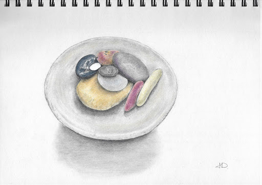
JD loves to walk and on her walks she always has an eye out for the odd rock or two, and so, over the years she has amassed a collection of lovely, colourful and unusual stones that she displays in a stoneware dish. This is the subject for her 'Ornament' drawing this week.
Her drawing shows a lovely selection of stones in a pleasing arrangement contrasting the shapes and colours. She drawn this in a Windsor Newton 200gsm heavyweight paper diary with Faber Castell colour pencils and HB pencil. JD tells me she also used that Mexican thingy... the 'tortilla' to blend with- lol - it's a TORTILLION or paper stump - guess your and Monika's spell checker keep correecting that for you.   
The stones are nicely rendered and the balance of colours is good. I think the very white stone stands out a little bit and could use just a touch of shading on the shadow edge to give it better form. I like the shadow placed under the bowl. JD says she is not 100% happy with the bowl shadow and considered adding a line behind the bowl to indidcate the edge of a table, but I don't think that is needed. What I do think is that the shape of the shadow tells me that the bowl is very deep, but the shadows within the bowl tell me it is shallow. So perhaps the shadow shape should be altered? I did a rough 3Dpaint scribble to show you this and the rock so you can compare and see if you like it or not before changing anything.
A really pleasing work JD, you should be very pleased with this one.


'Rock Collection' by JD

Suggested modification by Linda


Monday, 24 August 2020

Week 15: KM, Monika & Silke

 Week 15 final submissions

In spite of the difficulty of the prompt, you all made a great effort and did some good work. Our final three submissions are from KM, Monika & Silke.

Monika

Monika really embraced the challenge, watched you tube videos and drew several works from large pages of works, from charcoal to pencil, from A4 to A5 size. The first work shown here she says she feels is still unfinished and was created using Staedler graphite pencils in HB, 2B, and 4B with a 'tortilla' (I think she means tortillion/paper stump 😁) and eraser. This is done in her visual diary which accounts for the grainy texture of the pencil work - a smoother paper would have given less grain.
Monika has observed the light direction well, creating highlights on the tops of clouds showing how the light is coming from the right. Good darks under the clouds enhance this. A good study of some fluffy cummulus clouds whith their distinctive fluffly white tops and flatter bottoms.

'Clouds' by Monika

Monika has also submitted her final cloud drawing using the same mediums as above. This drawing is perhaps a bit more interpretive and less literal than the above attempt. As a result although it may not be as realistic as the above, it has a more dynamic and passionate feel. Still recognisable as cumulus clouds this work has a lot of character. 
It is good to see the variety and progression in Monika's work as she experiments and tries different ways to render the subject. These prompts are not about getting things 'right' or creating masterpieces, but about exploring, seeing, learning, trying new things and most of all, drawing. Well done Monika. 

'Clouds over the Mountain' by Monika

KM

Another artist trying new things is KM. She is just discovering the fun of drawing with soft pastels. She has chosen a dynamic composition of an old Santa Fe church framed against a deep blue sky. KM has used a combination of browns, blues, white and grey soft pastels. She hasn't told me what type of paper she has used - and the paper type can affect how much pastel can be layered. A toothy or sanded paper with more grip will hold more pastel and allow for more layering.
As a novice to pastels KM's drawing is a good beginning - with good use of perspective and colour sense works. Some brighter highlights could assist to lift the work more. One issue she says she had is trying to blend the pastels together. In my experience it takes practice to blend pastels well. I use a soft brush or cloth if I try to blend, but usually I rely on layering the colours adjacent and over each other to build up the hues.  Also, with pastels the more colours you have the better. Most pastel artists do not try blending to create colours, but reley on a palette with a vast selection of hues. One pastel artist I know has a table 3 x 2 meters that is covered with his hundreds of different pastels! You don't need that many KM, but if you want to work more in pastels start collecting - I have around 100 or so different colours and I still don't think that is enough! You don't buy them all at once, but when you next want to draw a pastel work study what the image needs and see what you have available in your palette. You may want to go out and just purchase one or two new colours, this will slowly build up your choices to hand. 
This work shows a lot of promise and I hope you keep exploring the fun of pastels!

Pastel artist Karen Margulis posts a good video HERE on painting skies. This award winning artist has some great tips on pastel skies - especially her special blue box of sky!

'Santa Fe Church' by KM

Silke

Finding an inspiration for aether was difficult, Silke tells me. She started with wax and ink to create a work showing the northern lights, but says that though the results were interesting it wasn't what she was looking for. Mind you, I would still like to see that work, Silke! 
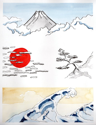
After that attempt Silke looked at various Japanese artworks as she enjoys the way this style of art handles landscapes and skies. I too really love Japanese woodblock prints and silk paintings, so these three mini-studies she has created in pen with Japanese watercolour are a delight.
This stylistic approace concentrates on the essentials only, using line and color or tone to express the forms. Silke has channeled her inner Hokusai in these three studies creating a lovely finish to week 15 prompt, Aether.

'Three studies of sky' by Silke

*Submissions for Week 15 is now closed - thank you all for taking this journey.*


Sunday, 23 August 2020

Drawing Prompt Week 16

Ornament

I hope you will all find this weeks prompt 'Ornament' a little easier! 😏 
Perhpas you have a favourite Doulton figurine. Or maybe a car hood ornament like the Silver Lady on a Rolls Royce. It could be an ornamental door knocker you spotted while in Florence. Or maybe the plaster rosettes and acanthas on the walls of the Victorian Artist Society Building. A detail of iron lacework on a Victorian Terrace. A favourite Christmas tree decoration. A pretty brooch or pair of earings...
whatever you choose to ornament your life.

I would like you to produce this work in either graphite or colour pencil and graphite. 

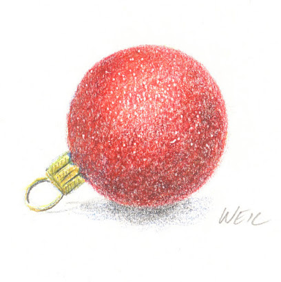
'Red Bauble' by Linda Weil.
Fabriano HP 300gsm, Staetdler Mars Karat pencils, HB graphite pencil. Indening tool


WIP - part of a larger drawing illustrating the book 'Metal Fish, Falling Snow' by Cath Moore. 2B graphite pencil on tracing paper, second draft.

Someday I am going to draw this guy - he looks pretty angry having that
loop stuck in his mouth! Door knocker in Florence, Italy.


Saturday, 22 August 2020

Week 15: JD, K, Jean, & Don

Four more join the 'Too Hard Club'

As I said, this was a difficult prompt, but it was great to see some more works flowing in yesterday. Although many have found the theme was a struggle, these artists perservered and pushed through. Each has used a different medium with different techniques creating wonderful results. 

JD

JD says she was going to pass this one up, thinking it was too difficult and spent a day or two 'Kondo-ing' her cupboards instead. 😀 In the end, she found an Instagram image of a wheat field at sunset as a reference and gave it a go. Using Faber Castel colour pencils and some HB she has created  nice image in her Windsor Newtion 200gsm visual diary.
I am very pleased she did not 'give up' as the result is a luminous view of sunset clouds. JD feels that the depth in the clouds is lacking as she found layering and building up the colours with the FC pencils unsatisfactory. (Q. Did you put a hard board under the paper - or try to draw on the cushioned pad of the visual diary? That can make a difference to the 'give' of the paper and how much you can layer the pencil.) I think JD is being a bit too hard on herself as I feel she has caught the glowing colours well. A bit of dark purple or Plum colour may have increased the depth in the shadows.
Also, JD says she felt she needed to use the black pencil for the wheat field in sillouhette. I agree that was the right choice for this effect - but maybe some of that dark purple/plum could overlay the dark and graduate up into the stalks?
This is a good work JD, well done for perservering

'Wheat Field at Sunset' by JD

K

Brrrr - its' been a miserable few cold and wet days here in Lock-Down Melbourne and this has inspired K to create this quick sketch in graphite pencil on Canson 220gsm drawing paper. She hasn't told me where it is, perhaps the old RSL building in Mentone? Or is it the view from her flat in Richmond? No matter, with this work she has captured the Gothic gloom of our current weather  and social situation.
A lovely atmospheric sketch.

'Wet Saturday' by K

Jean

A sunset camel ride on Cable Beach, Broome was Jean's chosen subject for the challenge. She has used Mi-tiens black pastel paper with Stabillo Carbethello pastel pencils. Her approach was to draw the positive colours, letting the black of the paper show through to create the camel shapes and shadows and depth in the water and colours. A tricky thing to try and Jean makes a good effort.
Jean says she had trouble with the camel legs and had to tweak them a bit - I assume she means with a black pastel (?) but it still works well. I especially love how the she has achieved the darker foreground and camel shadows in the water enhanced by some sparkling reflections.
I would suggest that you invest in a few softer pastels as well Jean, to tip on top of the Carbethello at the end . This would add brightness to the drawing that you cannot get with Carbethello. A good soft white and maybe a light yellow would help make the sun and reflection pop.
You are congratulated for this drawing Jean - it is not an easy way to work and the image you have created is quite expressive and has a great mood.

'Camels at Sunset' by Jean

Don

Last, but certainly not the least, Don has been experimenting with creating skies and clouds in graphite. With a 5B graphite, blending paper stump and eraser Don has created a cloud scape in his Windsor Newton Visual diary. The effect he has achieved is very 'cloud' and is a good result.  Although we have used a similar technique in our class, Don watched a YouTube video to help him. I have asked for the link and will update later. Don spent a good hour drawing these fluffy Cumulus clouds and he says he gave his eraser a real workout! As I said, a very good result - one tip - Don could also have used a bit of BlueTack to lift out areas that needed lightening without the hard white created by the eraser.

'Cumulus Clouds' by Don

Friday, 21 August 2020

Week 15: CursedGirl

 It's intangible.

CursedGirl

CursedGirl has looked at Aether in a slightly different way. She has completed this work as a school project but decided that it would also relate to this weeks prompt. Aether, the stuff around and above us, was also thought the medium through which sound travels. CursedGirl has created this flowing typographic drawing illustrating the word 'Music' - the thing that fills the air around her.
Created in graphite pencils on a smooth paper CursedGirl has used blending and smudging techniques to achieve a gradiant tone to indicate a metallic shine. The curves and swirls of the letters resemble the clefts of musical notation. A lyrical expression of typography that uses the letter forms to create an artistic meaning.

'Music' by CursedGirl

Thursday, 20 August 2020

Week 15: MP

 Yes, it is a tricky prompt

When I chose this week's prompt 'Aether', I realised it was a tricky one. It is open to many interpretations. Hey, you can't all have it easy every week! I love the word... 'Aether'... Aristotle called it the fifth element (no, not Mila Jovovitch), it was thought to be the main element used in the creation of the Philosopher's Stone (nothing to do with Harry Potter), scientists used to believe it was the stuff that light moved through (even Einstien was confused by it). As an element it doesn't really exsist, it is more of a concept to create with; it is a colloquial expression of an abstract idea of the the intangible void.  To me conjurs up gentle zephyrs, starry nights and spectacular sunsets. Just like this beautiful drawing of WA Dunsborough wetlands sunset by:

MP

Using Canson 300gsm HP paper with Prismacolour watercolour pencil washes overdrawn in Prismacolour Premier pencils MP has created a glowing sunset scene. The sky is coloured with golds, reds, pinks violets and deep purples that are reflected in the water. MP says she nearly gave up half way through but I am pleased she perservered. MP has managed to catch the fleeting glory of that glorious sunset in this drawing. Nicely done!

'Dunsborough Sunset' by MP


Wednesday, 19 August 2020

Week 15: Rosalie

Rosalie

This weeks theme 'Aether' is unusual, and Rosalie has given us an unusual work to ponder. This is a small work that fits into the Miniature category at 100mm x 80mm created on Fabriano 300gsm Hot press with watercolurs and gel pens. Rosalie deliberately used a naive technique, not aiming for the photorealism which is her usual style, but drew and painted in a loose free form way to evoke and express her feelings. She has used no references to create the figure or images but worked from her emotions only.
It is a rather striking piece. The cowering figure on the left is enclosed and confined in a box, its' pose expressing dejection and depression and a lack of hope. But over the rainbow is the cure, a shot or vaccine and the promise of feeling better. 

'2020' by Rosalie

I am always excited to see how each of you interperet the theme. I was thrilled to see this work from Rosalie - she dared to do something different and it resulted in an interesting and creative reaction to the prompt.

Monday, 17 August 2020

Week 14: Silke & KKat

 Silke

Silke has combined her Saturday drawing sessions with our prompts - Saturdays theme was 'Cats' and when joined with our 'Tail' prompt she has produced this drawing of a sinuous lioness stretching and flipping her tail at us. Silke has used her Cretacolour oil based pencils to draw this. These colours work nicely and her fur strokes flow well over the animals' muscles. I enjoy the fluid lines of the shape and the pure pleasure on the lioness' face as her tail nearly touches her brow. Anatomically speaking, the head, back and tail are quite good. The forelegs I feel are a bit too short and could have been elongated more for correct length and to accentuate the stretching pose. However, Silke has caught the expression and pose of this big cat well and created a drawing that tells its 'tail' well.

'Stretch' by Silke


KKat

Arachnaphobes beware! 
KKats submission this week is a White Tailed Spider. Many myths surround this lovely arachnid - they are not the human flesh eating monster of urban myth but will happily munch on the daddy-long-legs hidding the loungeroom corners! 
Staedler Graphites 2H, 2B, and 4B with a Faber Castell 6B on paper created this work. This was a new paper KKat purchased while in France, Clairefontaine Graf It 90g Sketch 41 lbs. I do not know this paper and KKat reports it as being a bit 'scratchy'. This has actually given a nicely hairy result to her pencil rendering.
A pleasing study, well observed in detail. However, she does float a bit, why not consider adding a cast shadow under the spider to ground her?

'White Tailed Spider ' by KKat

Please note submissions for week 14 are now closed.
If you would like to join in our weekly prompt drawings please contact me via the contact box on the right for further information.


Sunday, 16 August 2020

Drawing Prompt Week 15

 Prompt: Aether

According to ancient and medieval science, aether is the material that fills the region of the universe above the terrestrial sphere.
In other words, the sky.

So, the sky is the limit! 

Clouds, sunrise, sunset, moons, stars, birds flying in the sky, skyscrappers reaching to the heavens. Or just a lovely sky as a background to your overall work.
Artists who loved the sky: Turner, John Constable, Van Gogh, Franklin Booth, Hokusai, Cezanne... and so many more!

HERE is a good article to inspire.

As I am an artist who draws from preference rather than paint, my skies tend to be in pencil or in ink, or sometimes pastel. Use color or stick to monotone - your choice. 

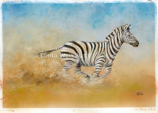
'Zoomie' by Linda Weil. Sky and dust in pastel

'Cloud Warrior' by Linda Weil. Colour and graphite pencil

'View from Tiburon' by Linda Weil. Ink


Saturday, 15 August 2020

Week 14: Jean, Don & KM

 Three for Three!

Three more great submissions telling tails.

Jean

While on holiday in Greenland, it felt like chilly Melbourne winter day but in fact it was a warm spring afternoon. Surrounding Jean were heavy coated sled dogs lazing in the 'warm' sun; their thick coats making it too hot for them to do anything but sleep. 
She has used Prismacolor Premier pencils on Strathmore Toned Tan 118gsm paper to depict one of the tails of these thickly furred dogs. Jean has layered and mixed white, grey green light, cream, 50% french grey, 50% warm grey, yellow ochcre and blue indigo to achieve this lush coat. The hints of indido and yellow ochre lift the tonal hues of the drawing and she has concentrated on drawing the depth of shadows in the fur thus creating the light fur. Nice work Jean!

'Lazing Sled Dog' by Jean

Don

This week Don is also taking us on a holiday whale watching! To create this view of a humpback display he has used Derwent and Prismacolour pencils on Canson 220gsm fine tooth paper, 150mm square. 
Don has created a slightly choppy sea in various blues keeping the white of the paper to show the white caps and sparkling light reflection in the sea. The shape and rolls of the waves is very good. I think that Don could experiment a bit more with colour layering. Maybe a bit of darker green could have been added to the sea in the wave hollows creating more intensity of colour? The fluke is very flat black, Don says he felt he would have liked it in ink but as this was a pencil challenge he worked in black pencil. The fluke is well drawn in shape and again Don is careful to retain the paper white as required to show the mottled tail pattern. To avoid the flat black tone of black and increase the depth in hue of the the tail I would have used an indigo blue first, then layered deep ochre brown then black.  The sky has been created using Prussian blue, smoothed with a cotton bud then lifted with a kneadable eraser creating a good effect.
A good work Don, nice design and well observed.

'Whale fluke' by Don

KM

KM has delighted me again with her drawing this week. In fact, I got a little choked up when I saw and read her work. The poem accompanied by the drawing tell a bittersweet tale of a much loved companion. Rocky enjoys his retirement sleeping on a bed of roses.
This has been drawn in KM's visual diary, 110gsm papaer using Derwent colour pencils (yes, she tells me she mixed yellow and blue for her greens) as well as graphite pencils F, HB, 2B, and 4B for Rocky's winter coat.
Although the shape of the mat is probably true to life, I think you could have altered it - I find the L shape a bit awkard and distracting from the main image of snoozing Rocky.  His fur is built up well and has the 'feel' of the rough textured coat of the terrier breed.
I would love to see you draw this on better paper KM!

'The Tale of Rocky's Tail' by KM

Friday, 14 August 2020

Week 14: K & Rosalie

 Telling Tales continued...

... beginning with K

I honestly cannot describe how delightful I find this next work. It is both creative and imaginative. When drawing from the imagination you need to draw from memory, to know and understand how things work and are put together. Drawing in this way can be totally realistic, or, as in this case, a flight of fantasy. K's grandson loves dragons and plays the game Dragon Nest. He is fascinated by all the different types and colours and stories of all the dragons. K has drawn this dragon tail and sent it to him for him to draw and complete the body. What a great way to connect with your family during this lockdown.
 Notice how K's knowledge of bird feathers, snake and reptile scales and zebra stripes have all contributed to the creation of this drawing. She has used graphite on Canson 220gsm drawing paper. This is a magical work.

Nana's Dragon Tail by K

Rosalie

Rosalie has sent in the start of a larger work of  some ground parrots she photographed grazing on the grass in Fitzroy gardens.  I think it is an Eastern Rosella...or maybe a male Red Rump, but it is certainly a parrot tail! Once she has completed the rest of the bird we can definitively name it as both those birds have blue/turquoise tails with red on their lower backs. Rosalie has used Fabriano 300gsm hot press and Polychormo colour pencils. It appears Rosalie has also used some indenting techinques to keep her white edges clear. Lots of nice layering techinque used here in the tail and feather work. It is good to see this build up of color used in the tail and feather, it creates lush, deep hues that shine.
Regarding the grass, shapes are good and the use of the yellow brown helps to create depth. As Rosalie will be aware I am a real grump when it comes to using green straight off the pencil for grasses and I prefer to see a build up of colours: yellow>light blue>yellowgreen>red or violets>dark blue> THEN the green pencil. Not saying what Rosalie has done is in any way incorrect, I just personally find the green pencil has more life and depth when you build it up in layers from primary colours. 
This is an engaging drawing of a handsome bird and I hope to see the entire work - I know Rosalie will create something stunning.

A Tail of Many Colours by Rosalie

Thursday, 13 August 2020

Week 14: JD & MP

 Tricky Tails

A bit of a tricky subject this week - I can tell a few of you are still thinking about what to do. To inspire you JD and MP have drawn some great images of animals with flamboyant tails. First up is:

JD

I would like to congratulate JD on her superb drawing of this fancy goldfish. She has used her Windsor Newton 200gsm heavyweight diary with FaberCastell Graphite and FaberCastell Polychromo pencils.  Note her attention to colours and layering, flowing lines and strokes in the tail - I love how you can 'see' through the front tail fin to the one behind. The tail works and is enhanced by the upright top fin, which almost glows with colour. The geometric effect of the scales and shine created with yellow splashes works perfectly. JD has used a light graphite to delineate the edges of the shape, but has paid attention to how it blends into the slivery belly of the fish so it is not a hard outline.
Honestly one of your best drawings yet JD.


Goldfish by JD

JD created a second work as well - that of the rear end of a zebra. Always a fun zebra pose to draw - and a view the animal likes to present to you when it sees your camera.  Again in the WN diary with the same pencils this is a creditable piece. The shape of the animal is good and I like how JD has used ochres and indigo in the stripes to create more depth in the black. Stripes are hard to concentrate on, these work well. I would prefer to see shading to create the edges of the form rather than dark outlines, and I think the background needs work - it is a touch on the scribble-rush side, but points for including. The slight offset to the composition works well.


Zebra by JD

MP

MP has drawn a bushy tailed Red Squirrel just like the ones she used to watch in her garden as a child in England. And he's a lovely fellow! The shape and anatomy of the animal is quite well observerd, especially the grasping hands. The layering of the hair and fur is good and flows in the correct direction. The tail is very well done, lots of layering of colours to build up to a big fluffy bushy tail. I would have liked to see the shadow line where the tail meets the body eased off and graduated into the body more and perhaps a little more shadow shading in the back leg and tummy. Don't do any more now MP if you feel it would over work the drawing, just note for future.  Like JD above, points for adding a grounding to the animal, but again I feel it has been a little rushed.
The work is well drawn and really shows the character of the animal well. The use of colour is great - MP has not been afraid to include magentas, blues and violets into the fur to create texture and colour. His face with it's white whiskers and bright brown eye is very engaging. Well done on this one MP.

 
Red Squirrel by MP


Sunday, 9 August 2020

Week 13: Monika and Silke

 Here are the last two submissions for Week 13 Prompt: Ruin

Monika

This is a drawing of an old shed Monika spotted while on a drive through East Gippsland to Port Albert. She has drawn this image in her visual diary using a Artline fineliner 0.4.
 What you see here is her first attempt. It has a lovely freshness and unaffected joy to the linework and drawing. It has a cartoon quality about it that is joyful - remember, a good cartoon distills the visual down to the essentials and is a unique artform.  But Monika felt that the realism in the perspective and shading could be improved upon so she began again. In her second drawing she became so hassled trying to correct the perspective and shading that she lost all enjoyment in the work and gave up in frustration. Monika learned an important lesson - you need to enjoy your work as you do it. Yes, we can learn and improvements can always be made to a drawing but it is also possible to overwork and think too hard about something and take all the pleasure out of it.
This linear sketch is relaxed and fun. It is a shed, plain and simple, drawn without fuss and I love it.
Old Shed by Monika

Silke

Once again Silke has given us and interesting subject and drawing. This week she has drawn the Genbaku Dome in Hiroshima. This was the only structure left standing where the first atomic bomb was dropped on August 6, 1945 and is now the Hiroshima Peace Memorial. She has used colour pencil, 0.1 and 0.3 Fineliner pens in her Stilman + Bern diary to create this arresting drawing.
I wondered if some of the perspective could be improved, especially the shape of the dome, but then on reflection I think this can't be a perfect architecturally drawn shape. Rather, the twisted framework enhances the drama and sadness of the building and what it means. 
Silke wondered if the colours were too bright, the red brick being too prominent - again, to me this reinforces the grief with that hint of blood red colour. The sky cracked open on that horrible day in August and Silke has subtley shown that with the way the overhanging branch frames and splits the sky. 
A drawing we can all think and reflect on.

Genbaku Dome, Hiroshima by Silke

Don't forget to start thinking and drawing for Week 14 announced below this post!

Drawing Prompt #14

 And so, there hangs a...

Tail

(or, if you prefer, Tale)

That is right - tell me tale or draw me a tail! Tell a tale of tails! Please use pencil and/or colour pencil - concentrate on working dry, but if you feel you want to work a water soluble pencil wash first no worries - but please keep primarily to the dry pencils.

A Lions Tale by Linda Weil. Colour and Graphite pencil on 300gsm hot press

There Hangs a Tail by Linda Weil. Colour and Graphite pencil on 300gsm hot press


Jack by Linda Weil. Graphite pencil on 300gsm hot press


Myth of the Bunyip by Linda Weil. Graphite pencil on 300gsm hot press
Bob Doesn't Have a Tail by Linda Weil. Watersoluble graphite and graphite pencil on 300gsm cold press

*Please note that Week 13 'Ruin' is now closed for submission

Saturday, 8 August 2020

Week 13: Jean, Don & KatK - *Updated with KM*

 Jean

Jean and her husband travel to the Victorian Snowfields regularly and pass this wonderful old Oxley Flourmill building along the way. I am familliar with this building as well and have often thought it would make an excellent subject for a drawing - you beat me to it, Jean! She has used Inktense pencil washes on Arches 300gsm cold press with a black Adel fineliner pen for detail. Jean discovered that with Inktense washes you are 'stuck' with your final result and must plan your drawing and perspective first - it has actually worked out well Jean, as I said in an earlier post, drawing the perspectives in these older buildings is forgiving as everything is slightly out of plumb anyway. She was also concerned that the colours may have come out too strongly, but I really like the effect and think it works well. It is nice to see you go bold!

Lovely work Jean.

Old Oxley Flourmill by Jean

Now, I did say that Week 12 submissions were closed - but last week I gave Jean a hard critique on her 'hand' drawing. Now I would like to show and congratulate her on taking those suggestions and trying again with a different pose. Her second attempt at drawing her hand is far more successful in proportion, tone and observation. The thumb is a tad bit thin, but then, Jeans hands are slender compared to my stubby paws so I believe this is a much more accurate portrayal. Well done Jean.

My left hand - second attempt by Jean

Don

Don is never afraid to take on a challenge - and here he has done a wonderful drawing of Crickhowell Castle in South Walks on an A3 sheet of 210 smooth. A3!!! My goodness!  As well, he has used quite fine pens to draw this with, a Unipin 0.1, a Copic 0.03 and 0.05. 

I can really appreciate the brick/stone techique Don has used here. Although he has drawn each stone individually it is done in a looser almost scrumble technique that is very effective. His observation of the perspective, particularly of the very difficult rounded tower is well done. Use of thick and thin lines to create interest works well. Don tells me he found it difficult to create tone with just black line not easy, yet it succeeds well. If you wished Don, you could have considered using a light tone wash of ink instead, and you could still do so over the dried permanent inks if you wished. Not really needed  though, this is a adept and pleasing drawing.


Crickhowell Castle by Don


KatK

When KatK told me she was going to try stippling/pointilism in her ink drawing, I must admit I sighed and rolled my eyes a bit. Don't get me wrong, I LOVE the effect of ink stippling and have great admiration for those who have the patience and stamina to produce a work with the technique, it is just so darned time consuming and I didn't think KatK really understood what she was getting into. I am afraid I may have been somewhat discouraging to her

So, I take it all back - KatK has proved me wrong once more and her first attempt at an ink stipple drawing is pretty darned good - she says she did find it challenging but enjoyed the process.

KatK has used a photo she took of a large bronze statue by Igor Mitoraj when she was last in Sicily. To create this work she has used Art Spectrum 210gsm Draw and Wash paper and a Unipen 0.5 and a Staedler Pigment Liner 0.1. There is a nice mix of techniques in this drawing, linework, stippling and crosshatching. I think her use of stippling is effective and works well combined with the deep cracks. There are two suggestions I would make on this work - the first is that we have no indication of the actual size of this statue, which is very large indeed. The second is that the drawing is 'floating' and a viewer unfamilliar with the original bronze, which lays on its side, may well think that the work should be rotated 90° clockwise. The simplest way to fix both these things would be to add a ground, a few whisps of grass and stones would seat the work as well as indicate scale. 

A good piece KatK and I hope you do some more stippling in future!

Igor Mitoraj Sculpture in Sicily by KatK

*KM

Just 10 minutes after posting all of the above, KM came through with this delightful drawing of the Colosseum from a photo she took back in 2014. While I think it is a great drawing I have to growl at KM because it is not in INK as the brief asked, tsk tsk. But we will forgive her as it is an expressive and evocotive work. Created using Mars Pastle pencils, Derwent blue pencils for the sky, and 4B graphite for darks on 210 gsm. I do like the way KM has been developing her style and gaining confidence to explore and push her drawings further.  Nicely done!

The Colosseum by KD

*REMINDER* If you are still working on your Week 13 prompt please send in today (Sunday, Melbourne Australia time). It will be posted early next week. If you cannot complete by today you can still send it in as a WIP.